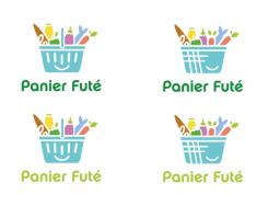
I changed a few details.
Design a logo for a start-up against food wasting !
- Contest holder: raodath
- Category: Logo design
- Status: Ended
- Files: File 1
Start date: 20-01-2014
Ending date: 05-02-2014
It all started with an idea...
A short, interactive guide helped them discover their design style and clearly captured what they needed.
Brandsupply is a platform where creative professionals and businesses collaborate on unique projects and designs.
Clients looking for a new logo or brand identity describe what they need. Designers can then participate in the project via Brandsupply by submitting one or more designs. In the end, the client chooses the design they like best.
Costs vary depending on the type of project — from €169 for a business or project name to €539 for a complete website. The client decides how much they want to pay for the entire project.
No comments
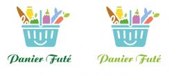
I prefer this last font.
Thanks
^__^
No comments
I like these designs.
Regarding the font i think there still some improvements here. I'm not really fan of this one.
I'm also looking for a leaf on the e in Futé.
Thanks Ailin and that's a good job.
No comments
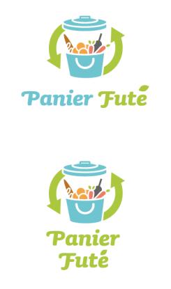
Thanks Ailin but it reminds me a garbage and that's not the image we want to send.
No comments
Thanks Ailin but it reminds me a garbage and that's not the image we want to send.
No comments
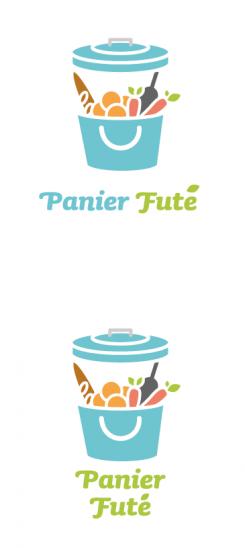
Ok this one reminds me a shopping bag you use to shop in a market. That's a good point.
I'm still fan of the castel color of your design. It sends a positive image.
Regarding the foodstuffs can it be more precisly designed?
I think you should remove the bootle, i think that's what sending the picnic image. Maybe replace it by a milk, and add tomatoes.
I still cannot guess what is the yellow food beside the carrot. That's why i think a more precise design is required for the foodstuffs.
Thanks
PS: the font of "Panier Futé" should be less bold and more baroque like the one mikidejanovic is using. The leaf on the futé is not distinctive enough for example.
Thanks Ailin
No comments
Good job on this one.
Is it the meat in yellow? If yes, it is not easy to guess. I like the global message in this design.
I really like this design but i'm not really sure it's sending the good message.
I feel like it's a picnic basket, not a basket you use for groceries. But it's really a cool design.
Thank you for your message, it is very encouraging !
No comments
Thanks Ailin. I think the fox is too much in this one.
No comments
Thanks Ailin for your submission.
We like the fact that the basket is included. But can you put some foodstuff inside like vegetables, meat, bread and yogourt.And cand you imagine something to convert the food wasting message.
Thanks
 Nederland
 België
 France
 Deutschland
 Österreich
 United Kingdom
