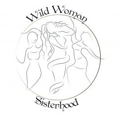
No comments
Design a Logo for an allready world wide known organisation for Women
- Contest holder: WildWomanSisterhood
- Category: Logo design
- Status: Ended
- Files: File 1, File 2, File 3
Start date: 16-07-2013
Ending date: 13-08-2013
It all started with an idea...
A short, interactive guide helped them discover their design style and clearly captured what they needed.
Brandsupply is a platform where creative professionals and businesses collaborate on unique projects and designs.
Clients looking for a new logo or brand identity describe what they need. Designers can then participate in the project via Brandsupply by submitting one or more designs. In the end, the client chooses the design they like best.
Costs vary depending on the type of project — from €169 for a business or project name to €539 for a complete website. The client decides how much they want to pay for the entire project.
If you go back to my first design (1a-c) you will find a description explaining the direction I took :) thank you !
No comments
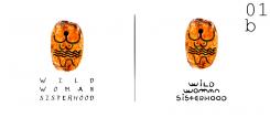
This is more of an illustrated description of design 3. thanks! :)
This is more of an illustrated description of design 3. thanks! :)
I was mainly inspired by the idea of woman and her connection with
/ earth / moon / water / goddess figures unearthed in old temples :)
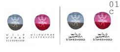
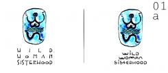
Using the very letters of Wild Woman Sisterhood I came up with the following designs. I used the letters to construct a figure standing for woman.
Therefore the figures are composed of W W and S
the first W = hands up in the sky
the second W = breasts
the S = dancing legs on earth
I added the head which could stand for moon or earth to make it look like a female figure...The water lines stand for the water / emotions connection between the sky & earth within the belly of the woman. Colour wise - I went for earth colours / inspired by rock paintings
What follows are some variations on the above notion.
Thank you and I hope you like them :)
1a - c
+ + +
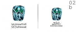
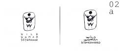
2a - b
Same concept using more angular lines more rune like than curvy
+ + +
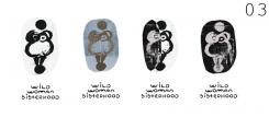
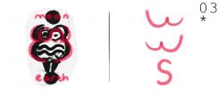
3* - a
Still using the letters to compose a figure...
In this case I was inspired by some old statues of goddesses found in Malta and also in other countries.
The goddess with a moon for a head stands on earth sky connects with earth through water
+ + +
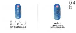
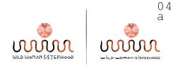
4a - b
Moving along the same lines yet in a slightly different manner...
Connecting the W W S I ended up with a snake
“Snake is the archetypal symbol of the Great Mother Goddess, incarnate in one of her most universal forms. It is also a symbol of the Kundalini Shakti energy, the cosmic feminine energy that ignites and fuels our spiritual awakening process.”
or also a series of connected breasts
The moonlike face - serene woman
+ + +
Font wise - Fonts used were 3
one is my creation and the other 2 were free downloads from dafont
font / epistolar - masklin // font / Standard Nib Handwritten Regular - http://dougsheets.com/
 Nederland
 België
 France
 Deutschland
 Österreich
 United Kingdom
