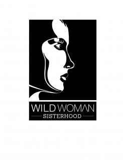
This logo was build up in black and white, strong because of its simplicity. I've used simple lines to create a characteristic woman's face, that resembles all the women behind the Sisterhood. The face is feminine and tough as well.
The name was cut up in pieces. Wild Woman is the first piece, written in a straight, no-nonsense font which is slightly modified: the A is missing the horizontal line. (This way it refers to greek mythology to a woman called 'Labda' who stood up for herself and her son and the Greeks are also associated with wisdom.) Sisterhood is the second piece, written in a strong serif, so it has a friendlier look and feel. The word sisterhood is between lines that resemble connection.
Design a Logo for an allready world wide known organisation for Women
- Contest holder: WildWomanSisterhood
- Category: Logo design
- Status: Ended
- Files: File 1, File 2, File 3
Start date: 16-07-2013
Ending date: 13-08-2013
It all started with an idea...
A short, interactive guide helped them discover their design style and clearly captured what they needed.
Brandsupply is a platform where creative professionals and businesses collaborate on unique projects and designs.
Clients looking for a new logo or brand identity describe what they need. Designers can then participate in the project via Brandsupply by submitting one or more designs. In the end, the client chooses the design they like best.
Costs vary depending on the type of project — from €169 for a business or project name to €539 for a complete website. The client decides how much they want to pay for the entire project.
 Nederland
 België
 France
 Deutschland
 Österreich
 United Kingdom

