In this logo I kept the design as simple as possible while making it friendly, luminous and creative. This makes the logo eye catching and interesting but also memorable and distingushable.
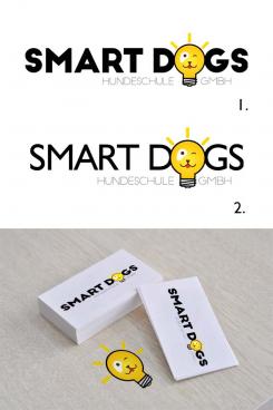
In my design I used a simple black typeface (font) for the name and a stylizd lightbulb with a minimalistic dog face inside, to make it represent the idea of the 'smart dogs'. I integrated the lighbuld design into the text, because this way the viewer percieves the symbol more natually and it creates a bond between the name and the logo, which makes it more memorable.
I have used a simple typeface for the text, so it doesn't distract the viewer too much from the symbol and the name. In the 1st design I used a very bold typeface which makes the lighbulb symbol seem more integrated in the text and the yellow looks darker. In the 2nd design I used a lighter font, which makes the lightbulb stand out more and the yellow looks lighter too. But in both cases the colours are the same.
For this logo design I used black, 2 shades of yellow and a shade of red. The black invokes profesionalism, and seriousness, while the yellow keeps it bright and friendly.
I chose those colours because I believe a pet school should have the characteristics of professional but aso friendly place where animals can learn and have fun. The minimalistic dog face in the bulb looks happy and is winking for the same reason, so the pet owners feel their dog will be happy and safe in your school. This way you build trust in your target audience.
I hope you like the design!
If you have any questions and suggestions, please don't hasitate to share them with me.
Best Regards,
Hristo
PS. Please give me some feedback if you like the design :)
Thank you!
Design a modern logo for SMARTdogs
- Contest holder: SMARTdogs
- Category: Logo design
- Status: Ended
Start date: 29-10-2015
Ending date: 09-11-2015
It all started with an idea...
A short, interactive guide helped them discover their design style and clearly captured what they needed.
Brandsupply is a platform where creative professionals and businesses collaborate on unique projects and designs.
Clients looking for a new logo or brand identity describe what they need. Designers can then participate in the project via Brandsupply by submitting one or more designs. In the end, the client chooses the design they like best.
Costs vary depending on the type of project — from €169 for a business or project name to €539 for a complete website. The client decides how much they want to pay for the entire project.
 Nederland
 België
 France
 Deutschland
 Österreich
 United Kingdom

