No comments
Design a powerful logo for an energy/power company
- Contest holder: Hamidah Ismail
- Category: Logo design
- Status: Ended
Start date: 02-09-2014
Ending date: 24-09-2014
It all started with an idea...
A short, interactive guide helped them discover their design style and clearly captured what they needed.
Brandsupply is a platform where creative professionals and businesses collaborate on unique projects and designs.
Clients looking for a new logo or brand identity describe what they need. Designers can then participate in the project via Brandsupply by submitting one or more designs. In the end, the client chooses the design they like best.
Costs vary depending on the type of project — from €169 for a business or project name to €539 for a complete website. The client decides how much they want to pay for the entire project.
Hi Hamida,
Thanks for the feedback! Here are some proposals for the logo. I did some adjusting of the font and Quaesar aswell so it looks more powerfull than the ones i made before. I've also intergrated the 'Q' in the word and made it so it can stand alone and still be recognizable. I hope you like it! Once again if there's anything you would like to see changed, let me know.
Best regards,
Dennis
No comments
Dear Hamidah,
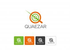
Here are my designproposals of the Quaezar-logo. If there's anything you like to see adjusted just let me know. I hope you like the designs.
Best regards,
Dennis
Hi, thanks for the submission. I can see a quasar resemblance in the logo. But something is not right with the colour combination. Could you try with only orange and some shade of gray or black for the Q. Also i'd like to see how it looks like if the logo Q is incorporated with the company name, but at the same time the Q can also be used as a standalone logo. Thanks!
 Nederland
 België
 France
 Deutschland
 Österreich
 United Kingdom
