No comments
Design a recognizible and modern logo for a great radiostation
- Contest holder: Vgreen
- Category: Logo design
- Status: Ended
Start date: 24-09-2020
Ending date: 08-10-2020
It all started with an idea...
A short, interactive guide helped them discover their design style and clearly captured what they needed.
Brandsupply is a platform where creative professionals and businesses collaborate on unique projects and designs.
Clients looking for a new logo or brand identity describe what they need. Designers can then participate in the project via Brandsupply by submitting one or more designs. In the end, the client chooses the design they like best.
Costs vary depending on the type of project — from €169 for a business or project name to €539 for a complete website. The client decides how much they want to pay for the entire project.
No comments
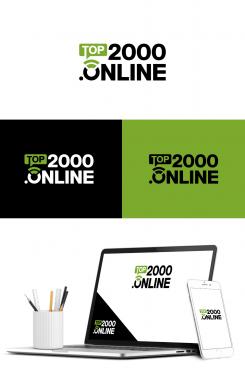
Love both your designs, this on is probably our favorite.
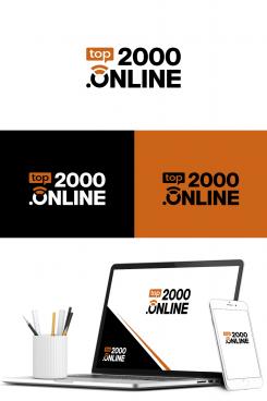
Small problem with this one is that the "TOP" part reads like "TJOP" because of the triangular shape between T and the O.
In the first design you created the "top" in a red color, which made it more vibrant.
In short, we would prefer the "top" of the first design on this design.
Small note, the use of the color red isn't preferred, due to likeness to other logo's.
We could suggest #cb6318, but you're input as designer is valued.
Thank you for your design, and hope to see a other one.
 Nederland
 België
 France
 Deutschland
 Österreich
 United Kingdom
