I worked on a different concept too.
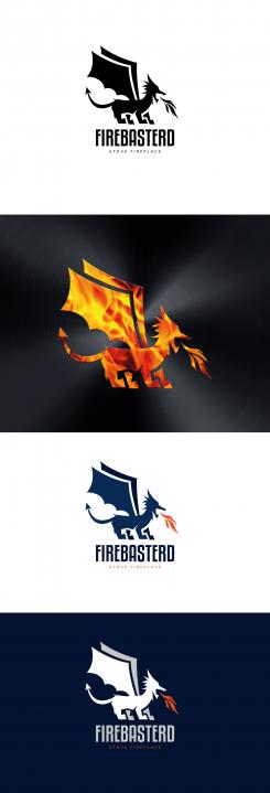
A distinctive and modern dragon
Design a robust and clear logo for an outdoor fire stove.
- Contest holder: 21deg.
- Category: Logo design
- Status: Ended
- Files: File 1, File 2
Start date: 05-09-2018
Ending date: 19-09-2018
It all started with an idea...
A short, interactive guide helped them discover their design style and clearly captured what they needed.
Brandsupply is a platform where creative professionals and businesses collaborate on unique projects and designs.
Clients looking for a new logo or brand identity describe what they need. Designers can then participate in the project via Brandsupply by submitting one or more designs. In the end, the client chooses the design they like best.
Costs vary depending on the type of project — from €169 for a business or project name to €539 for a complete website. The client decides how much they want to pay for the entire project.
Good to also make a different concept, but your other one I like better!
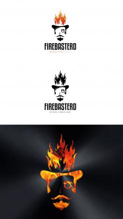
Ok, I understand. Here is another one with less détails. Now it doesn't look like a Skull. We keep the impact.
Moreover, the laser cutting is possible.
What do you think?
Great job, I like it.
Thank you ! Let me know if you want anything else
Hi,
I understand what your colleagues mean. It is difficult with a minimalist style so I tried to make it more realistic.
Now the problem will be the laser cutting...
But is it very important for you? or we can give priority to the stationery and web version.
Hope you will like it.
Hi Wilko, thanks for going this route, but I like it less. The previous version without realism is stronger. Also the laser cutting is for me essential since that will make the fireplace so much more unique.
I hope you can work with this?
Hello,
I am glad you like my work. Here is a color version with some example.
What do you think about it?
Hi Wilko, I did not realize that Dutch is not your native language.
Great job. I am really exited. I showed it to some of my colleagues with many years of marketing experience and I received the following feedback that I wanted to share with you.
Their first feeling when looking at the logo was "horror" like. It looks like a skull...
Their opinion is that negative associations should be prevented in a logo.
Can you make it more positive? Less a skull? Perhaps naughty, misschievous, rascal, boy-like kind of feeling.
I understand that this is not an easy task, but looking at your skills so far I trust that you can work with this.
Looking forward to your results.
 Nederland
 België
 France
 Deutschland
 Österreich
 United Kingdom


