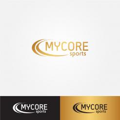
Hello, I changed the curves. They are more proportional (I made those other one to give design a little more 3d looking.
Design a sleek, modern and simplistic logo for a sports nutrition brand!
- Contest holder: mycore
- Category: Logo design
- Status: Ended
Start date: 02-05-2016
Ending date: 16-05-2016
It all started with an idea...
A short, interactive guide helped them discover their design style and clearly captured what they needed.
Brandsupply is a platform where creative professionals and businesses collaborate on unique projects and designs.
Clients looking for a new logo or brand identity describe what they need. Designers can then participate in the project via Brandsupply by submitting one or more designs. In the end, the client chooses the design they like best.
Costs vary depending on the type of project — from €169 for a business or project name to €539 for a complete website. The client decides how much they want to pay for the entire project.
No comments
Something about the curves looks a bit off, but I do like this one. But do you think you could fix the proportions or make the spacing a little more balanced, especially the distance between the curves.
Thank you!
Like the top part of the curve seems too thin on the inner curve.
Hello, I did changes on "sports" text and curves.
Hello, I used Bebas as font and it looks better. I have three color versions, let me know which you prefer. Thank you!
This does look better and the color versions I do prefer are the gold on white and the gold on black.
I think this looks good but something about "sports" throws me off, could you fix that?
Maybe because its lowercase or that the whole font needs to be changed
Do you think you could also do some other variations with the curves?
Thank you!
No comments
I like the concept but do you think you could change the font?
Suggestions would be something like a variation of Bebas, steelfish, or libel suit.
Thanks!
Thanks!
 Nederland
 België
 France
 Deutschland
 Österreich
 United Kingdom
