No comments
Design a striking logo for a sword art association
- Contest holder: Bernulf
- Category: Logo design
- Status: Ended
Start date: 23-05-2017
Ending date: 30-06-2017
It all started with an idea...
A short, interactive guide helped them discover their design style and clearly captured what they needed.
Brandsupply is a platform where creative professionals and businesses collaborate on unique projects and designs.
Clients looking for a new logo or brand identity describe what they need. Designers can then participate in the project via Brandsupply by submitting one or more designs. In the end, the client chooses the design they like best.
Costs vary depending on the type of project — from €169 for a business or project name to €539 for a complete website. The client decides how much they want to pay for the entire project.
No comments
Dit is wel een mooi ontwerp qua lettertype en stijl, maar het is niet zo duidelijk wat voor vereniging het is. Het zou ook een wijnlabel kunnen zijn.
In English: I like the font and the style, but it's not very clear what kind of organisation we are. It could be a wine label ;)
Dear Bernulf,
here is my first vision about your company.
Hope you like it.
If you have some suggestions, please feel free to contact me.
Kind regards,
m3kdesign.wix.com/portfolio
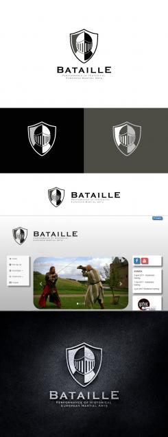
Thanks! This mask is more 15th century, whereas we do 13th-century re-enactment. So it doesn't quite fit our club.
 Nederland
 België
 France
 Deutschland
 Österreich
 United Kingdom


