No comments
Design an attractive logo for a company who does the paperwork for small businesses.
- Contest holder: Katapela
- Category: Logo design
- Status: Ended
Start date: 22-10-2015
Ending date: 01-12-2015
It all started with an idea...
A short, interactive guide helped them discover their design style and clearly captured what they needed.
Brandsupply is a platform where creative professionals and businesses collaborate on unique projects and designs.
Clients looking for a new logo or brand identity describe what they need. Designers can then participate in the project via Brandsupply by submitting one or more designs. In the end, the client chooses the design they like best.
Costs vary depending on the type of project — from €169 for a business or project name to €539 for a complete website. The client decides how much they want to pay for the entire project.
No comments
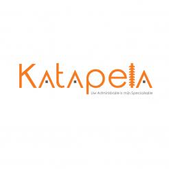
Hi! Thanks for your contribution. This logo seems a bit confusion to me because of the use of both pointy and more round fonts. It's not in balance, the dots of the A should be on the same height as the line in the E. The special L is a good effort to mix the bug in the logo but I think it is not clear. After all, mixing the bug in is not a priority.
 Nederland
 België
 France
 Deutschland
 Österreich
 United Kingdom


