No comments
Design the logo for the next top sportbrand!!
- Contest holder: kas kleinnijenhuis
- Category: Logo design
- Status: Ended
Start date: 05-04-2017
Ending date: 12-04-2017
It all started with an idea...
A short, interactive guide helped them discover their design style and clearly captured what they needed.
Brandsupply is a platform where creative professionals and businesses collaborate on unique projects and designs.
Clients looking for a new logo or brand identity describe what they need. Designers can then participate in the project via Brandsupply by submitting one or more designs. In the end, the client chooses the design they like best.
Costs vary depending on the type of project — from €169 for a business or project name to €539 for a complete website. The client decides how much they want to pay for the entire project.
I know BP is a bit boring, but if you want random i can do random .mvg WSS
No comments
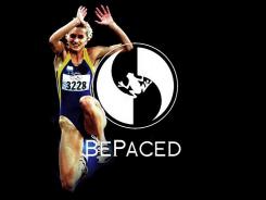
In the center is a circle with the letters BP where by the B is mirrored
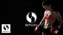
In the center is a circle with the letters BP where by the B is mirrored
No comments
looks great! can you try to add something to the symbol? It has to be a little more unique. Can you also change the lettertype to something a little more serious?
No comments
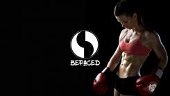
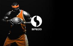
My design looks abstract but both the letter B & P are in the logo. The P is visible, flip the logo upside down and the B is then clear. In my humble opinion the logo shouldn't need text to be recognizable. People should look at the symbol and say, BePaced. I hope you like my design. Obviously any colour in combination with any font is possible. mvg WSS
hi WSS, I like your design, very impressing.! I like the simplicity about it but I think the logo should be a little more recognizable. so I like the circle but maybe you can make some changes to the little black form within the circle. it may look a little more high end
 Nederland
 België
 France
 Deutschland
 Österreich
 United Kingdom
