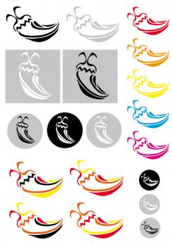
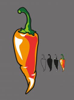
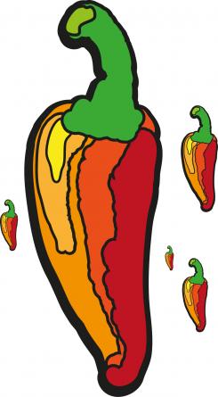
Without any gradient
Epic Pepper Icon Design
- Contest holder: Tjarco
- Category: Logo design
- Status: Ended
- Files: File 1
Start date: 24-09-2013
Ending date: 23-10-2013
It all started with an idea...
A short, interactive guide helped them discover their design style and clearly captured what they needed.
Brandsupply is a platform where creative professionals and businesses collaborate on unique projects and designs.
Clients looking for a new logo or brand identity describe what they need. Designers can then participate in the project via Brandsupply by submitting one or more designs. In the end, the client chooses the design they like best.
Costs vary depending on the type of project — from €169 for a business or project name to €539 for a complete website. The client decides how much they want to pay for the entire project.
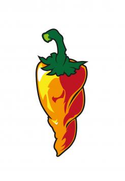
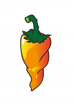
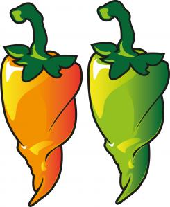
Different stern and minor changes on bottom.
Hope you like this better.
Best regards,
Amat
W00t, what a follow up!.. yes this bottom has the right ammount of grungy wrinkles, it's seasoned and looks tough. 2,5 things: the whole thing is a about 25% too long and if only you could incorporate a stronger top section this could be a high competitor (why the grey background?).. You blew me away with this one after your first submission honestly..
Glad you like it. Grey background was just for a different contrast. Will incorporate adjustments and await response.
Best regards,
Amat
 Nederland
 België
 France
 Deutschland
 Österreich
 United Kingdom
