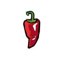
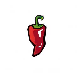
Thanks for the quick feedback, here is the adjusted one, hopefully what you meant.
Epic Pepper Icon Design
- Contest holder: Tjarco
- Category: Logo design
- Status: Ended
- Files: File 1
Start date: 24-09-2013
Ending date: 23-10-2013
It all started with an idea...
A short, interactive guide helped them discover their design style and clearly captured what they needed.
Brandsupply is a platform where creative professionals and businesses collaborate on unique projects and designs.
Clients looking for a new logo or brand identity describe what they need. Designers can then participate in the project via Brandsupply by submitting one or more designs. In the end, the client chooses the design they like best.
Costs vary depending on the type of project — from €169 for a business or project name to €539 for a complete website. The client decides how much they want to pay for the entire project.
Hmm stern and corner are good, the shape however became less strong than your other one, I'm sorry if we send you in the wrong direction. This one is missing the 'dent' on both sides which makes the other one more appealing.
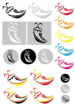
Hi, not sure if I should write in english, but I will. Here is my idea for the pepper. Looking forward to your reaction,
Connie
Yes! 4 colors, black outline, kinda wrinkly/aged, best submission so far. Few points of improvement: 1. from a distance it doesnt't look like a pepper, maybe you can move the bottom part a bit to the left to make the right side a bit more diagonally tapering down to the bottom (hope this is clear) 2. can you mirror the stern (just feels better) and the right top corner is a bit pointy.. Great work!
P.S. I'm keeping everything in English for the international competitors
 Nederland
 België
 France
 Deutschland
 Österreich
 United Kingdom


