No comments
Epic Pepper Icon Design
- Contest holder: Tjarco
- Category: Logo design
- Status: Ended
- Files: File 1
Start date: 24-09-2013
Ending date: 23-10-2013
It all started with an idea...
A short, interactive guide helped them discover their design style and clearly captured what they needed.
Brandsupply is a platform where creative professionals and businesses collaborate on unique projects and designs.
Clients looking for a new logo or brand identity describe what they need. Designers can then participate in the project via Brandsupply by submitting one or more designs. In the end, the client chooses the design they like best.
Costs vary depending on the type of project — from €169 for a business or project name to €539 for a complete website. The client decides how much they want to pay for the entire project.
No comments
Yeah the two dents on the left side are cool. I think is will look better when the corners are more bevelled (round) than edgy corners..
No comments
Every submission getting better than the previous
No comments
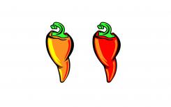
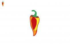
These colors are a bit less cool than your other orange proposal, stern is still a bit pale though, not bright shining green. The shape is not a winner, yet.
No comments
These colors are cool, stern is a bit pale though, not shining bright green. The shape is not a winner yet.
No comments
I like the wrinkles created on both sides with the black outlines. Every design of yours is coming closer to the strong and confident pepper we are looking for.
Hello Tjarco ,
Thanks! what can i do to make this one better i like the feedback on it!
with regards Petje
No comments
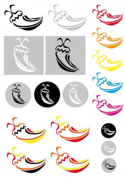
This coloring style is to abstract, it doesnt accentuate the shape or structure fo the pepper.
Shape is getting better but feels like you copied our example (wire drawing) which we thought wasn't strong enough at all..
Yes maybe were i looking to much at the example Tjarco
gonna try make it better !
thanks for your feedback again!
regards Petje
No comments
This coloring style is to abstract, it doesnt accentuate the shape or structure fo the pepper.
No comments
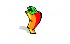
This is heading in the good direction
Hello Tjarco
Thanks!
And your feedback is welcome to make it better
with regards Petje
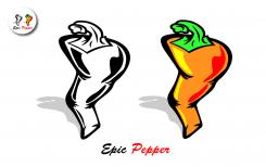
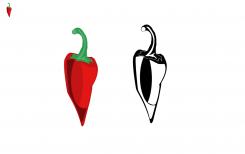
Stern could be a bit less long and a bit wider. The bottom shape of the pepper is too simple. Colorscheme could use more oranges and yellows.. Black & white version is just ehh.. weird? haha
Hello Tjarco
Gonna work on it thanks for your feedback Tjarco
with regards Petje
 Nederland
 België
 France
 Deutschland
 Österreich
 United Kingdom
