No comments
Help us design a logo which gives professional athletes the right impression about us!
- Contest holder: btimmer
- Category: Logo design
- Status: Ended
Start date: 16-11-2016
Ending date: 08-12-2016
It all started with an idea...
A short, interactive guide helped them discover their design style and clearly captured what they needed.
Brandsupply is a platform where creative professionals and businesses collaborate on unique projects and designs.
Clients looking for a new logo or brand identity describe what they need. Designers can then participate in the project via Brandsupply by submitting one or more designs. In the end, the client chooses the design they like best.
Costs vary depending on the type of project — from €169 for a business or project name to €539 for a complete website. The client decides how much they want to pay for the entire project.
No comments
Hello,
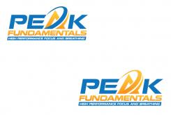
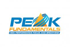
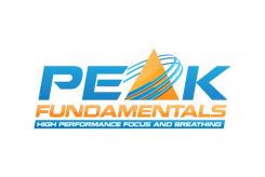
Thank you for the feedback! An updated version here. Hopefully moving in the right direction. Clik on picture for proper previewing.
No comments
Hi Aksa, we like your design but can you do some modifications? Can you change the colors more like aditasing with a bright orange. can you do the PE K blue the A orange and the fundamentals orange as well. And a thick blue stripe with the undertext in white letters so it jumps out. and for the accent on the A , can you try 2 and make them the point going up maybe after a full circle up, and in colour blue. maybe that works better. thanks looking forward to it!
 Nederland
 België
 France
 Deutschland
 Österreich
 United Kingdom
