No comments
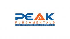
Help us design a logo which gives professional athletes the right impression about us!
- Contest holder: btimmer
- Category: Logo design
- Status: Ended
Start date: 16-11-2016
Ending date: 08-12-2016
It all started with an idea...
A short, interactive guide helped them discover their design style and clearly captured what they needed.
Brandsupply is a platform where creative professionals and businesses collaborate on unique projects and designs.
Clients looking for a new logo or brand identity describe what they need. Designers can then participate in the project via Brandsupply by submitting one or more designs. In the end, the client chooses the design they like best.
Costs vary depending on the type of project — from €169 for a business or project name to €539 for a complete website. The client decides how much they want to pay for the entire project.
No comments
Thank you Yozana! can you try to tilt the PEAK, so give it a slight slanted letters and maybe the A too, see if it works?
colours are great now.
Thank you for feedback Sir.
I have new revision, please check..
Best Regards
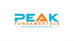
Hi Yozana, I just talked to my partner I think were getting really close now. We also would like to see one without the small blue triangle, so slanted like the instuctions above but one with and one without the blue triangle. great! looking forward to it! the coulours are heaps better! if you are at it can you do one of the two, with a blue that is a fraction less purple, same darkness of blue but just a little. were close though.
yes great but maybe the next one only PEAK slanted and fundamentals and the subtext just normal
i have unrated the first few designs so you can delete them, so you dont get to your maximum number.
thanks so much!
i have unrated the first few designs so you can delete them, so you dont get to your maximum number.
thanks so much!
i have unrated the first few designs so you can delete them, so you dont get to your maximum number.
thanks so much!
No comments
thanks Yozana, i will discuss with my partner, we like your designs!
No comments
Hi Yozana, we like your design but we want to try something, can you try one with the P closed, and do you have an E which is the same style but not quite so bend a little straighter? also can you make the orange a little darker and more red/fluerescent? and the blue maybe just a little bit darker. and the stripe with the subtext can be wider and the letters a little bigger if possible. thanks!
No comments
Thanks Yozana, looks good. Maybe can change the A to the other one you did, without the white stripe. Maybe a little bit thicker, or with a different accent. It is the symbol of our business. We provide people with a solid foundation on which they can have a higher peak so it is an important part of the logo.
No comments
Hi Yozana! Thanks for your designs, we like this one, can you do some modifications?
For the colours can you look at aditasingh, she is close on that.
Can you do something with the E so the bottom line of the E doesn’t look a bit fat? See if that works (maybe shorter?)
Maybe you have another suggestion, to give the tekst some movement, just subtle, don’t go overboard. Maybe just by the edging of the letters somehow like you did with the front upperside of the E, just to see if there is some improvement possible here. We like the P!
Maybe even a variation with some more rounded off letters? I’ll leave it up to you.
Can you also try to do something with the A so it seems less edgier? We miss something in the A maybe we don’t like the sharp corners it has, like the top has been chopped off or something, can you improve the A, make it something to show for?
Could you make a stripe below , a thick blue stripe, maybe a darker blauw than the tekst above, and put the subtekst in here so the white letters in the subtext will “jump” out. The letters of the subtekst can be a few notches bigger.
Looking forward to your update!
Cheers,
Bryan
 Nederland
 België
 France
 Deutschland
 Österreich
 United Kingdom
