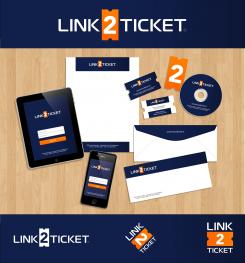
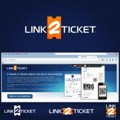
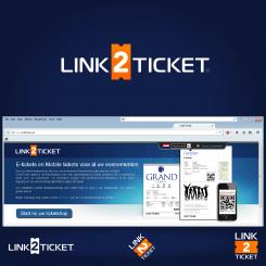
The overall best solution: very clean, simple, iconic, eye-catching, and versatile to use in "square" format as well as "horizontal", works well in one color, and with a myriad of different applications. I know you have some reservations about the "old" ticket symbol, but this is creating a visual symbol that says "TICKET" immediately to the observer. As I said before, compare it to the "floppy disk" icon most software still uses to denote "SAVE" in the menu bar. Even though the symbol is anachronistic, it still conveys the CONCEPT perfectly. I would love to be your designer. Let me know if there is anything else I can do for you. Cheers from Florida ~ Max
Logo + business card for E-ticketing company
- Contest holder: avilevy
- Category: Logo design
- Status: Ended
Start date: 17-07-2014
Ending date: 31-07-2014
It all started with an idea...
A short, interactive guide helped them discover their design style and clearly captured what they needed.
Brandsupply is a platform where creative professionals and businesses collaborate on unique projects and designs.
Clients looking for a new logo or brand identity describe what they need. Designers can then participate in the project via Brandsupply by submitting one or more designs. In the end, the client chooses the design they like best.
Costs vary depending on the type of project — from €169 for a business or project name to €539 for a complete website. The client decides how much they want to pay for the entire project.
Thank you for your feedback! I understand your comment about the "old style" ticket. The shape is meant more as a "visual element" rather than an actual representation of the current product - similar to how most software still uses the little "floppy disk" symbol to denote the SAVE function, even though nobody has used a floppy for decades - simply because it is a very strong visual icon that says "SAVE", just as this icon says "TICKET".
That said, here are some other possibilities, including a mobile device, a bar code, and a "modern style" ticket with a bar code on it. Not visually as strong as the old-style ticket, but see what you think about these. Thanks again, and cheers from Florida! :)
 Nederland
 België
 France
 Deutschland
 Österreich
 United Kingdom


