No comments
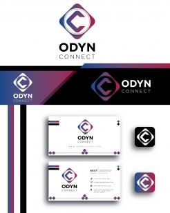
Logo company name software application
- Contest holder: matthijskoel
- Category: Logo design
- Status: Ended
- Files: File 1
Start date: 14-01-2022
Ending date: 28-01-2022
It all started with an idea...
A short, interactive guide helped them discover their design style and clearly captured what they needed.
Brandsupply is a platform where creative professionals and businesses collaborate on unique projects and designs.
Clients looking for a new logo or brand identity describe what they need. Designers can then participate in the project via Brandsupply by submitting one or more designs. In the end, the client chooses the design they like best.
Costs vary depending on the type of project — from €169 for a business or project name to €539 for a complete website. The client decides how much they want to pay for the entire project.
Hello,
I changed the font.
This with the "ARGENTUM EXTRA BOLD" font,
I hope you like it.
Regards
Hello,
I changed the font.
This with the "CAMAR" font,
I hope you like it.
Regards
No comments
Nice! zou je misschien nog kunnen uitleggen waar die bolletjes voor staan? En misschien andere font
Hello,
The key in the middle to show the solutions you offer to your clients,
I used many circles to refer to different solutions in different fields ( i think the circles looks good for SOFTWARE and ERP company , it's giving it the feeling of connection, organization and diversity, also it's a soft shape which makes the logo more friendly),
And to give the logo a motion as soon as the rectangle in the middle is moved in between the circles,
Also to give the logo the shape of a cloud,
And in a different way the logo looks like a car speed meter referring to data processing speed.
I used the blue color because it is often described as secure, orderly and seen as a sign of stability.
This logo, although it looks very simple, is complex and has many concepts, and it can express the company even without adding the name to it.
Regards
 Nederland
 België
 France
 Deutschland
 Österreich
 United Kingdom
