Logo you choose in complete preview.
Thank you again!
Kind regards,
m3kdesign
LOGO ELEPRESS
- Contest holder: confusus
- Category: Logo design
- Status: Ended
Start date: 07-03-2017
Ending date: 21-03-2017
It all started with an idea...
A short, interactive guide helped them discover their design style and clearly captured what they needed.
Brandsupply is a platform where creative professionals and businesses collaborate on unique projects and designs.
Clients looking for a new logo or brand identity describe what they need. Designers can then participate in the project via Brandsupply by submitting one or more designs. In the end, the client chooses the design they like best.
Costs vary depending on the type of project — from €169 for a business or project name to €539 for a complete website. The client decides how much they want to pay for the entire project.
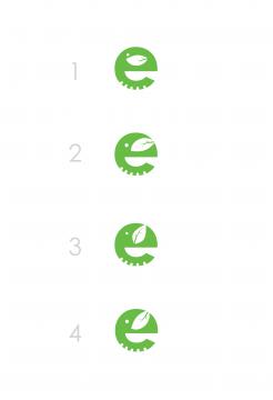
Here the some variations of logo shape for you.
Which one you like the most?
Heya. I must say I like the first version the most. Nice touch! Thank you for your design.
Dear confusus,
here is my vision about your company.
The elephant incorporated in one letter "e". Simple and friendly.
Hope that you like it.
If you have some suggestions, please feel free to contact me.
Kind regards,
m3kdesign.wix.com/portfolio
I really love it! My only doubt is about the placement of the ear. It also slightly looks like a coffee bean. The first impression is really neat though.
I really love it! My only doubt is about the placement of the ear. It also slightly looks like a coffee bean. The first impression is really neat though.
Thank you!!!
I wanted to keep the "e" letter look as natural and too much similar with its primary look.
I will edit the leaf so it does not look like a coffee bean.
 Nederland
 België
 France
 Deutschland
 Österreich
 United Kingdom


