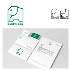
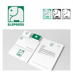
The logotype's design is a mix of geometrical and round shapes to show that the compactors are both industrial and environmentally friendly.
The power of the product is symbolized through the strong shape of the elephant which is stamping down on the text.
The font (free commercial license) is slightly horizontally extended. This gives it a slightly compressed effect which reflects the purpose of the compactor units. We selected a bold font which is powerful whilst remaining readable and clear.
Our goal is to make the Elepress company appear strong, modern and professional.
LOGO ELEPRESS
- Contest holder: confusus
- Category: Logo design
- Status: Ended
Start date: 07-03-2017
Ending date: 21-03-2017
It all started with an idea...
A short, interactive guide helped them discover their design style and clearly captured what they needed.
Brandsupply is a platform where creative professionals and businesses collaborate on unique projects and designs.
Clients looking for a new logo or brand identity describe what they need. Designers can then participate in the project via Brandsupply by submitting one or more designs. In the end, the client chooses the design they like best.
Costs vary depending on the type of project — from €169 for a business or project name to €539 for a complete website. The client decides how much they want to pay for the entire project.
Thank you for your design!
The logotype's design is a mix of geometrical and round shapes to show that the compactors are both industrial and environmentally friendly.
The power of the product is symbolized through the strong shape of the elephant which is stamping down on the text.
The font (free commercial license) is slightly horizontally extended. This gives it a slightly compressed effect which reflects the purpose of the compactor units. We selected a bold font which is powerful whilst remaining readable and clear.
Our goal is to make the Elepress company appear strong, modern and professional.
 Nederland
 België
 France
 Deutschland
 Österreich
 United Kingdom


