No comments
Logo Enjoyum. A fun, innovate and tasty food company.
- Contest holder: barnhoorn
- Category: Logo design
- Status: Ended
Start date: 04-05-2014
Ending date: 22-05-2014
It all started with an idea...
A short, interactive guide helped them discover their design style and clearly captured what they needed.
Brandsupply is a platform where creative professionals and businesses collaborate on unique projects and designs.
Clients looking for a new logo or brand identity describe what they need. Designers can then participate in the project via Brandsupply by submitting one or more designs. In the end, the client chooses the design they like best.
Costs vary depending on the type of project — from €169 for a business or project name to €539 for a complete website. The client decides how much they want to pay for the entire project.
No comments
Hi, I'm waiting for your comment.bests regard.
;)
Hey selenia, Thanks again.
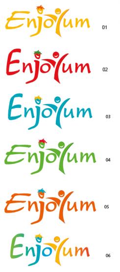
We really like nr 1, 4 and 5. Can you make 5 more orange instead of brown?
ok, thanks
No comments
here different colors, you like ?
See post in older design.
No comments
I'm waiting for your coment.thanks
You don’t want the « mouth », « smile », in the head ?
Yes that will be great! Can you also do something with the dot of the "j"?
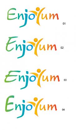
And can you make whole logo in the 4 different colors as well? (full green, blue, yellow, orange and red)
Thanks
Ok,I am going to do it. But which number did you choose ? lol. thanks
I like number 3 and 4 the most :-)
ok, thanks.
Looks great! We getting very close to a final design.
We will futher on this design (rather than the newest).
The J can stay as it was (so without the strawberry).
Some adjustments:
- Could you put the smiley in this design? (so in the Y).
- We like the 'E' from number 3 the most, lets focus on that one from now.
- We decided not to go for too much colours. The Y should be yellow, and the rest of the logo in another common colour, like blue, orange, red, green etc. Could you show a few examples?
Good luck! We look forward to a new iteration.
yes, thanks for the feeback!
No comments
Hi Selenia
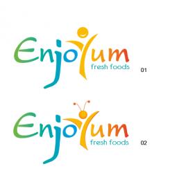
We really like this one! Some suggestions;
- Can you skip the feelers and the text "fresh food" by the lower one (2)?
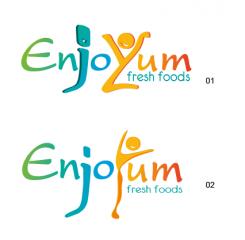
- Can you make the leg of the j a little shorter
- Can you make the "E" more straight, rather than a curve?
Thanks
ok, thanks for the feeback!
No comments
Hi,
I'm waiting for your coment. I hope that you prefer it.
Have a good day!
selenia
Hi Selenia,
We like the idea!
Can you do something with the human? (for example; give it Y line. in the center of the body).
Im in doubt that people cannot read the name (instantly).
Thanks
ok, thanks.
 Nederland
 België
 France
 Deutschland
 Österreich
 United Kingdom
