No comments
Logo for a new network sustainable energy/gender balance /SDC
- Contest holder: AA75
- Category: Logo design
- Status: Ended
Start date: 08-10-2017
Ending date: 15-10-2017
It all started with an idea...
A short, interactive guide helped them discover their design style and clearly captured what they needed.
Brandsupply is a platform where creative professionals and businesses collaborate on unique projects and designs.
Clients looking for a new logo or brand identity describe what they need. Designers can then participate in the project via Brandsupply by submitting one or more designs. In the end, the client chooses the design they like best.
Costs vary depending on the type of project — from €169 for a business or project name to €539 for a complete website. The client decides how much they want to pay for the entire project.
Couple of different options. Kind regards
Thank you!
No comments
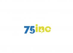
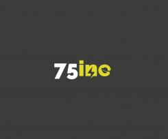
the energy is in this logo, but also the connect part and the eco part.
Thank you!
No comments
HI! I like the fonts of your first submission, but with the white background. I like the idea of the thunder (for energie), the links (for the network) and honestly, I thought from a distance that in "5" you had the world map. I have seen your portfolio and I like your work. Ideally, we would like something that contains a "symbol" that we can later on use to be identified by. Something like the "f" of Facebook or "bird" of twitter.
No comments
I like the part of "inc", shows the energy (ok, here only electricity, but fine) and the "green" aspect of it. I like the gray background a bit less. the 75 is neutral.
Dank je wel! Het mag in NL hoor :-) Wat zou u graag anders zien? Mvg Yvonne
 Nederland
 België
 France
 Deutschland
 Österreich
 United Kingdom
