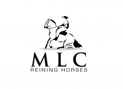
Logo for a Quarter Horses breeding for international Reining competition

Contest details:

  • Contest holder: reining60
  • Category: Logo design
  • Total budget: € 225.00
  • Start date : 15-04-2012 10:56
  • Ending date : 22-04-2012 10:52
  • Status : Ended
  • Required formats: jpg,psd,pdf,ai
  • Relevant files: None
  • Available languages:
  • Number of designs: 62
  • Response rate:
    low high

Needs:

The initial “MLC” are simply those of my children, so will remain as such. I would like a logo that can be adapted on multiple supports such as posters, clothing or vans. Ideally, the three letters should be interconnected and can resemble a movement figure from the discipline of reining (I also invite you to discover this sport on the internet for a better understanding) The baseline “Reining Horses” must be a part of the logo but is not always reflected in all supports. The important thing is to really make a "figure" with the three letters.

Company description:

"MLC Reining Horses" is a breeding “Quarter Horses” for major international competitions of Reining. The most known American Riding discipline. The Reining is a sequence of compulsory figures such as "sliding stop" or "spin".

- http://en.wikipedia.org/wiki/Reining

Target group:

From crosses of the best current standards from the U.S, our foals are for the greatest competitors in order to enhance the discipline of French breeding. They are sold through European websites or simply via network. Currently the best reining riders in the world besides the U.S., are Belgian, Italian or German.

Colors, favourites and other requirements

No brightly colours or American flag and at most 3 colours. The logo must be professional, luxury with refined motion and maybe the silhouette of a horse or rider. No photo. We must understand what it is about with three letters : Horses and Reining. The idea is to suggest movements that are the hallmark of the Reining. But beware, many others are using the "sliding stop" figure. The ideal would be to use the movement of the "spin", but I can imagine it will be difficult with letters as angular as the M and L. ... the idea is to embed them. Some examples below of logos that already exist but too many look alike .... so gather some info’s and let your creativity reign!

incognito designs
  • Logo design # 81703 for Logo for a Quarter Horses breeding for international Reining competition   contest Submit complaint
    1. incognito designs says

      one more attempt at without rider

    2. This contest is finished. Its not possible to reply anymore.

  • Logo design # 81698 for Logo for a Quarter Horses breeding for international Reining competition   contest Submit complaint
    1. Description by designer incognito designs:

      just horse no rider

    2. reining60 says :

      ok..non, better with its rider!

    3. This contest is finished. Its not possible to reply anymore.

  • Logo design # 81697 for Logo for a Quarter Horses breeding for international Reining competition   contest Submit complaint
    1. Description by designer incognito designs:

      hat less flat

    2. reining60 says :

      Much better!

    3. This contest is finished. Its not possible to reply anymore.

  • Logo design # 81567 for Logo for a Quarter Horses breeding for international Reining competition   contest Submit complaint
    1. Description by designer incognito designs:

      Hope that I have the positioning of the horse correct on this one :)

    2. reining60 says :

      This is the one I prefer among the three, but the hat doesn't look like a cowboy hat, maybe too flat....and could you try the same without the rider, just the horse?? thank you

    3. This contest is finished. Its not possible to reply anymore.

  • Logo design # 81529 for Logo for a Quarter Horses breeding for international Reining competition   contest Submit complaint
    1. No comments

    2. This contest is finished. Its not possible to reply anymore.

  • Logo design # 81508 for Logo for a Quarter Horses breeding for international Reining competition   contest Submit complaint
    1. reining60 says :

      Sur un bon sliding stop, le cheval doit avoir le nez presque par terre avec la bouche fermée et les rênes détendues. Joli design

    2. This contest is finished. Its not possible to reply anymore.

Social Network