No comments
Logo for buddy that helps you adopting Office 365
- Contest holder: sjoerdkoolen
- Category: Logo design
- Status: Ended
- Files: File 1, File 2, File 3
Start date: 21-08-2019
Ending date: 28-08-2019
It all started with an idea...
A short, interactive guide helped them discover their design style and clearly captured what they needed.
Brandsupply is a platform where creative professionals and businesses collaborate on unique projects and designs.
Clients looking for a new logo or brand identity describe what they need. Designers can then participate in the project via Brandsupply by submitting one or more designs. In the end, the client chooses the design they like best.
Costs vary depending on the type of project — from €169 for a business or project name to €539 for a complete website. The client decides how much they want to pay for the entire project.
No comments
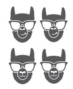
I will try to remove the glasses. I think this future result will be more reminiscent of the Alpaca.
No comments
Hey.. again an improvement and the best submission so far. The neck is still just as broad as its face and it could also be any other animal... + Are there ways to make it more simplistic? It needs to work as a chatbot icon almost just as small as the preview on the left of this text
Hello,
Which one do you prefer ?
Thank you
The right one.. but we really need more simplicity.. And i really hope we can do something creative like this way of working with colors http://prntscr.com/oy04cf or this way of being creative with shapes http://prntscr.com/oy04zd (that one being not happy enough nor looking for an ape but to for the idea)
No comments
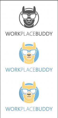
Really an improvement! Would it be possible to have sóme difference between neck and face? Would it be possible to use some colouring? Some light blue (perhaps in background of circle) and some matching light yellow or so?
Also curious if possible to have the Alpaca look slightly to the right
If I ask too much I'm sorry :)
 Nederland
 België
 France
 Deutschland
 Österreich
 United Kingdom
