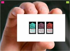
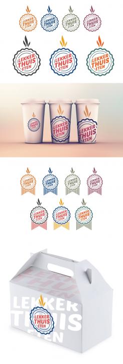
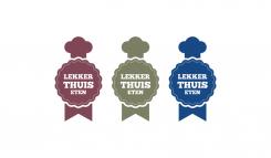
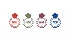
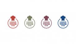
Logo for caterer who deliver good and fresh meals at home

Start date: 12-12-2014

Ending date: 07-01-2015

Total budget: € 199.00
Latest design
Book cover
MiliG

It all started with an idea...

A short, interactive guide helped them discover their design style and clearly captured what they needed.

Needs


For now we need a logo, eventually we also need business cards and packaging design.

Google ‘ready-to-eat meals packaging’ ALL you see is NOT what we would like to be.
Google ‘best design packaging’ and you see a lot of great innovative designs.

NEW! Pls notice I uploaded two new 'inspiration' briefings.

Company description


Name of the company:
lekker thuis eten (translation: nice/good food at home)

Sector:
caterer who deliver at home

USP:
- very good price/quality
- a fresh meal for every day
- for everyone, even with dietary

Target group


Target group:
- Everybody who wants a good, fresh dinner but isn’t able (or don’t want) to prepare the meal himself.

Colors, favourites and other requirements


Wishes for the logo design (principles of logo design):

1. Simple
2. Memorable (time will tell ;-))
3. Timeless
If the logo is used in black/white, it must be timeless. If we use the colours you suggest, it could be more fashionable. By the way: we love distinctive colours!
4. Versatile
We would like to receive it as a vector. The logo will at least be used for business cards, on packaging and website.
5. Appropriate
There’s no better way to explain then to quote David Airy:

‘A logo doesn’t need to say what a company does. Restaurant logos don’t need to show food, dentist logos don’t need to show teeth, furniture store logos don’t need to show furniture. Just because it’s relevant, doesn’t mean you can’t do better. The Mercedes logo isn’t a car. The Virgin Atlantic logo isn’t an airplane. The Apple logo isn’t a computer. Etc..’

Creativity of the logo:
Most important: remain the above principles! The creative part should be particularly shown up in the use of the logo.

Keywords:
No fork & knife!
No script letter!
Fresh
Chic
Tasty


Suggestions for colours:
- maybe combine pantone 494/pantone 571/white/gold
- maybe combine pantone 550/pantone 5185/pantone 187 and white
- or maybe find here your inspiration: http://www.modernehippies.nl/scholten-baijings/

Designer: 2ND 2ND
logo-logotip-dizajn-2nd-zwYgdt20

No comments

lekker thuis etenlekker thuis eten

Nice presentation!

The logo reminds me somehow to a fire department, but it looks fresh and modern. What I like about your logo is that the text wants to go 'out'. Nice.

lekker thuis etenlekker thuis eten

3 stars, but I would like to give 3,5. Does that makes sense?

2ND2ND

Thank you!
This "hot mark" means that the food is fresh, hot and "just prepared and ready to be eaten"
3 or 3.5 it doesn't matter :)

This contest is finished. Its not possible to reply anymore.
logo-logotip-dizajn-2nd-1llKuSye

No comments

This contest is finished. Its not possible to reply anymore.
logo-logotip-dizajn-2nd-19Rc6aae

No comments

This contest is finished. Its not possible to reply anymore.
logo-logotip-dizajn-2nd-0X7tIiCe

No comments

This contest is finished. Its not possible to reply anymore.
logo-logotip-dizajn-2nd-zuoAUpoe

No comments

This contest is finished. Its not possible to reply anymore.
logo-logotip-dizajn-2nd-zIURgxQe

No comments

This contest is finished. Its not possible to reply anymore.