No comments
Logo for caterer who deliver good and fresh meals at home
- Contest holder: lekker thuis eten
- Category: Logo design
- Status: Ended
- Files: File 1, File 2
Start date: 12-12-2014
Ending date: 07-01-2015
It all started with an idea...
A short, interactive guide helped them discover their design style and clearly captured what they needed.
Brandsupply is a platform where creative professionals and businesses collaborate on unique projects and designs.
Clients looking for a new logo or brand identity describe what they need. Designers can then participate in the project via Brandsupply by submitting one or more designs. In the end, the client chooses the design they like best.
Costs vary depending on the type of project — from €169 for a business or project name to €539 for a complete website. The client decides how much they want to pay for the entire project.
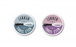
In this proposal I inserted again a wisk but used just one and more bright colors so I achieved better contrast. I think it can work well as a sticker and any two combinations (or even just one) of colors can work well. It was just an idea so I gave it a try. In general I wanted to achieve more flat-look design, rather than 3d gradients etc. Looking forward for your comments.
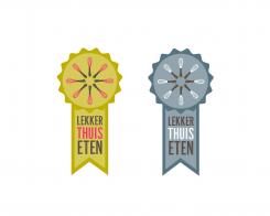
Here I wanted to try something that resambles badge with ribbon hanging bellow. Within the badge I put wisks which are placed radially from the centre (perhaps resambling a bit sun or a flower). If you have any suggestions how I can improve the design (e. g. color shades, font etc.) I am willing to adjust it.
I didn't see the whisks in the first place. Creative, nice! So this is the feeling about your option:
1. first: nope.
2. second: (seeing the whisks) great!
3. Hmm... is it perhaps too much fiddling?
4. I don't know it any more...
I know it's not helpful, sorry, but I would like to give you honest feedback.
This proposal is going towards more illustrative direction but I just wanted to give it a try. In the centre of the logo is an apple like most universal sign of good, healthy food. Looking forward for your comments and suggestions.
Thank you, I like your font. The apple isn't the right symbol, because we're going to deliver meals.
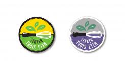
This logo proposal represents circle (fruit, vegetable) with the leafs on the top (alluding on healthy food). I wanted to keep it as simple as possible thus I was using only black-white-one additional color range. Maybe these can be changed depending of the type of the meal it is delivered (e.g. green/vegetarian; pink/deserts etc.). I am looking forward for your comments and suggestions so I can improve my design.
Well BowWow...it's great! There are some points, but really, it's very nice.
- It's not TUIS, but THUIS
- Like the leaf, but it could be a more modern on. Difficult to explane, but this looks like a illustrator excercise.
- we would like to use it as a sticker, when there is a white edge, there could exist cutting edge problems.
 Nederland
 België
 France
 Deutschland
 Österreich
 United Kingdom
