New Design & Composition ! Same comment
Hello !
Here is my design for your music label : Chuck Seagal.
To illustrate my speech I put some link in the end of the post.
I was initialy inspired by Googie Art. This is a 50's American Art movement used to signboard of Coffee shop and other Gas Station around the U.S. highway ( Road 66, Motel, Dinner, Las Vegas ... ). This movement represents futur, dynamic, virility and have a very Rock background.
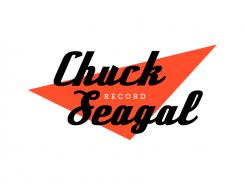
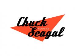
For " Chuck Seagal ", I have chosen a font inspired by chrome inscriptions on American motorcycles. It is oblique, fat, square and have a script/manual touch.
For " Record " I choose a slab font which adds a technical and Institutional side.
Red triangle, by its shape and color, is an offensive and dynamic force. It can also be seen as an abstract electic guitare.
This type of triangle with bright colors is also used by electronic label as R&S Record which play techno.
The color-coded "red, black, white" is well known in the communication to catch the eye and stimulate it (Marlboro, Coca-Cola, Russian constructivism ...)
To conclude, the design is influenced by american ideology and movements. It shows power, dynamic, technic and virility. There is a retro background and a contemporary aesthetic due to a minimal and sleek graphism.
I hope you will like my design. Please send me feedback !
Have a nice day !
Googie Art :
http://en.wikipedia.org/wiki/Googie_architecture
R&S Record :
http://eil.com/images/main/Various-Dance+-+R&S+Records+-+In+Order+To+Dance+-+DOUBLE+CD-448890.jpg
Russian constructivism :
http://www.designishistory.com/images/lissitzky/BeatTheWhites.jpg
Logo for
- Contest holder: ldemonta
- Category: Logo design
- Status: Ended
Start date: 12-05-2014
Ending date: 27-06-2014
It all started with an idea...
A short, interactive guide helped them discover their design style and clearly captured what they needed.
Brandsupply is a platform where creative professionals and businesses collaborate on unique projects and designs.
Clients looking for a new logo or brand identity describe what they need. Designers can then participate in the project via Brandsupply by submitting one or more designs. In the end, the client chooses the design they like best.
Costs vary depending on the type of project — from €169 for a business or project name to €539 for a complete website. The client decides how much they want to pay for the entire project.
Bonjour !
Voici ma conception pour votre label de musique Chuck Seagal Record.
Pour illustrer mes propos j'ai laissé quelque liens en fin du commentaire.
Je me suis dans un premier temps inspirée par le Googie Art. C'est un mouvement artistique américain des années 50's utilisé pour les enseigne des " coffee shop " et autre " gas station " aux alentours des autoroutes américaine ( Route 66, Motel, Dinner .. ). Ce mouvement représente le futur, la dynamique, la virilité et est très " rock ".
Concernant la typo de " Chuck Seagal ", j'ai choisis une typo inspirée des inscriptions chromé sur les motos américaine. Elle est oblique, grasse et carré tout en possédant une touche manuel/script. Pour " Record ", c'est une typo a empattement carré. Ça rajoute un côté technique et institutionnelle.
Le triangle rouge, par sa forme et sa couleur, représente une force offensive et dynamique. Il peut aussi être vus comme une guitare électrique abstraite.
Ce type de triangle aux couleurs vive est aussi utilisé par les label d’électronique indépendant comme R&S Record.
Le code couleur " rouge, noir, blanc " est quant à lui bien connu dans la communication pour accrocher l'oeil et le stimuler (Marlboro, Coca-Cola, Constructivisme Russe ...)
Pour conclure, le design s'inspire de mouvement et d'idéologie américaine tout en véhiculant des notions comme la force, le dynamisme, la technique et la virilité. Il comporte des bases rétro (authenticité) tout en étant contemporains grâce à son graphisme épuré.
J’attend vos retours en espérant que mon design vous plaira.
Bonne journée !
Googie Art :
http://fr.wikipedia.org/wiki/Googie
R&S Record :
http://eil.com/images/main/Various-Dance+-+R&S+Records+-+In+Order+To+Dance+-+DOUBLE+CD-448890.jpg
Russian constructivism :
http://www.designishistory.com/images/lissitzky/BeatTheWhites.jpg
_ _ _ _ _ _ _ _ _ _ _ _ _ _ _ _ _ _ _ _ _ _ _ _ _ _ _ _ _ _ _ _ _ _ _ _ _ _ _ _ _ _ _ _ _ _ _ _ _ _ _ _ _ _ _ _ _ _ _ _ _
Hello !
Here is my design for your music label : Chuck Seagal.
To illustrate my speech I put some link in the end of the post.
I was initialy inspired by Googie Art. This is a 50's American Art movement used to signboard of Coffee shop and other Gas Station around the U.S. highway ( Road 66, Motel, Dinner, Las Vegas ... ). This movement represents futur, dynamic, virility and have a very Rock background.
For " Chuck Seagal ", I have chosen a font inspired by chrome inscriptions on American motorcycles. It is oblique, fat, square and have a script/manual touch.
For " Record " I choose a slab font which adds a technical and Institutional side.
Red triangle, by its shape and color, is an offensive and dynamic force. It can also be seen as an abstract electic guitare.
This type of triangle with bright colors is also used by electronic label as R&S Record which play techno.
The color-coded "red, black, white" is well known in the communication to catch the eye and stimulate it (Marlboro, Coca-Cola, Russian constructivism ...)
To conclude, the design is influenced by american ideology and movements. It shows power, dynamic, technic and virility. There is a retro background and a contemporary aesthetic due to a minimal and sleek graphism.
I hope you will like my design. Please send me feedback !
Have a nice day !
Googie Art :
http://en.wikipedia.org/wiki/Googie_architecture
R&S Record :
http://eil.com/images/main/Various-Dance+-+R&S+Records+-+In+Order+To+Dance+-+DOUBLE+CD-448890.jpg
Russian constructivism :
http://www.designishistory.com/images/lissitzky/BeatTheWhites.jpg
 Nederland
 België
 France
 Deutschland
 Österreich
 United Kingdom


