Sir,
I already submitted 15 designs. If you want to change, please give me your email address. I will send you the correction design.
Logo for Demand Supply Management department within auto company
- Contest holder: DSM
- Category: Logo design
- Status: Ended
- Files: File 1, File 2
Start date: 18-02-2019
Ending date: 04-05-2020
It all started with an idea...
A short, interactive guide helped them discover their design style and clearly captured what they needed.
Brandsupply is a platform where creative professionals and businesses collaborate on unique projects and designs.
Clients looking for a new logo or brand identity describe what they need. Designers can then participate in the project via Brandsupply by submitting one or more designs. In the end, the client chooses the design they like best.
Costs vary depending on the type of project — from €169 for a business or project name to €539 for a complete website. The client decides how much they want to pay for the entire project.
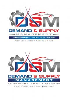
thank you for your submissions
No comments
increase size of department name, tweak car design-looks strange, gear still looks a bit like a tractor tire, M looks better so do the colors,
maybe add some color contrast between the curves and letters
No comments
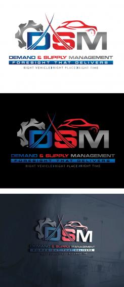
great design, like the gear and like that the 'D' is more apparent, try to make the 'M' more apparent and less like a sideways 'E', like how the curves match the letter color..wonder if a different tone/same color would look any better..a deeper red+blue may look better..another car design/wheel/clock from another designer looked better..what is the gauge by car window? like the arrow marks on motto
red color on car looks better that blue, enhance vehicle look, more concept/speeding car
colleague feedback: gear looks like a tractor/Caterpillar tire :( Please tweak the look, also car design can be tweak, like the idea but not the exact look
No comments
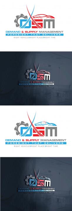
thanks for incorporating the full motto, can you make the font size/design more uniform? Also, is there a way to make the "D" more apparent as a D?
No comments
needs to have:"Foresight that delivers...' in the motto
Dear Sir,
This is a creative logo. I think it is a perfect design for your company according to your description. If you want changes, do not hesitate to advise me. Thank you.
No comments
whats the black and white in the car window? whats the red letter?, too busy looking with the letters, needs to be clear, and less like hieroglyphics
No comments
No comments
No comments
interesting, like the roadway in the curve, can we get these curves in equilibrium, car looks cool, make it more evident, less like a low lying crocodile, incorporate Foresight that delivers....
No comments
nice design, needs to have the foresight piece
Dear Sir,
This is a creative logo. I think it is a perfect design for your company according to your description. If you want changes, do not hesitate to advise me. Thank you.
Dear Sir,
This is a creative logo. I think it is a perfect design for your company according to your description. If you want changes, do not hesitate to advise me. Thank you.
No comments
i like the roadways use in the demand/supply curves
No comments
looks cool but hard to deciper, audience will also be people outside of this department, i.e. accounting, marketing, legal, etc...looks confusing
 Nederland
 België
 France
 Deutschland
 Österreich
 United Kingdom
