Hello DSM,
thank you for all the informations.
Since this will be the last entry i can make,
i did go full throttle and created 4 new versions of the Logo. I also added the Text on the Bottom as a stand alone to give you an better look on how the text looks like.
Best regards
GreenCinemaStudios
Logo for Demand Supply Management department within auto company
- Contest holder: DSM
- Category: Logo design
- Status: Ended
- Files: File 1, File 2
Start date: 18-02-2019
Ending date: 04-05-2020
It all started with an idea...
A short, interactive guide helped them discover their design style and clearly captured what they needed.
Brandsupply is a platform where creative professionals and businesses collaborate on unique projects and designs.
Clients looking for a new logo or brand identity describe what they need. Designers can then participate in the project via Brandsupply by submitting one or more designs. In the end, the client chooses the design they like best.
Costs vary depending on the type of project — from €169 for a business or project name to €539 for a complete website. The client decides how much they want to pay for the entire project.
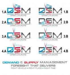
Maybe you can open this picture in a new tab window so you can view them better.
Hello DSM, Thank you for the rating.
Best regards, GreenCinemaStudios
Thank you for all the submissions
Hello DSM,
you're welcome, if there is anything i can do for you just let me know =)
Best regards
Kevin from GreenCinemaStudios
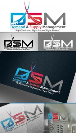
Hello DSM,
thanks for the feedback, I increased the gradient, added the check marks and changed the placement of "Foresight that delivers"
Best regards
GreenCinemaStudios
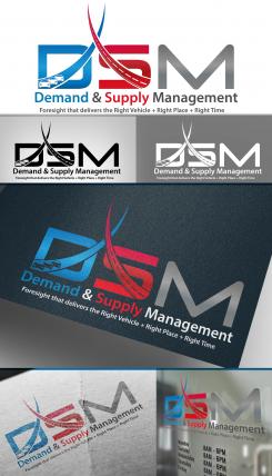
Hello DSM,
thanks for your feedback.
The graph is now equal and i tone down the curves.
I changed the colors and added a small gradient to make the colors more vibrant. I added a roadway to one and some cars to the other Curve.
Best regards,
GreenCinemaStudios
like the new concept, gradient works maybe a bit more would be ok for increased vibrancy
can you try something with the motto, liked what was done before of Right Vehicle-check mark... but also need to have Foresight that delievers...; maybe if you can somehow tie it without a straight line sentence which can be a blur of words..
*delivers
Hello DSM,
thank your for the rating.
here is another version of the Logo.
Best regards,
GreenCinemaStudios
liked the earlier design better with the roadway at the bottom, can you make a bluer blue and redder red? also as an idea, can you try making the demand/supply curve equal to be in equilibrium? as a concept...
actually if you can try making a design that was also similar to previous versions where the curves were even but using the newer versions were there is a curve for D and S, as it seems to help drive the point of being in equilibrium for demand and supply-that's our goal as a department...
try adding a roadway to the demand/supply curves, see how it looks...
can you incorporate a type of auto figure such as others have done to drive the point? it would help the visual
can you incorporate a type of auto figure such as others have done to drive the point? it would help the visual
No comments
No comments
Hello DSM,
thanks for the great feedback, i removed the color gradient, added a road and "foresight that delivers" above "right vehicle"
Best regards,
GreenCinemaStudios
Thanks for the revision. Try using the type of font that was recently added for the words... see how it looks. Color gradient was kind of cool, but a lighter version, so easily see the red vs blue would be nice to see
can you do a deeper red/blue? stronger color, less brightness..
Hello DSM,
thanks for the feedback, i will change the colors and will use a light color gradient.
I cant find the "Toyota Type" font on the web. (still searching)
The document says "Toyota Type" but shows "Arial" to me.
Best regards,
GreenCinemaStudios
keep that '&' sign instead of and
try toning down the curves, it might get lost in translation to some folks, try to bring in an automotive design to strengthen the message
No comments
Hello DSM,
this a new version with the graph, its on the "D" and "S" for Demand & supply.
Best regards,
GreenCinemaStudios
like the update to the coloring on the letters, did like the narrow roadway below the letters that you had before
can you try making the D a bit more blue, do like the blending but might be nice to identify the blue D for demand curve and S for supply, maybe try to incorporate foresight somehow, maybe 'foresight that delivers' right above the right vehicle...
Hello DSM,
here is a version based on my first entry.
Best regards,
GreenCinemaStudios
Hello DSM,
this is a upgraded version from the last entry, i added the little "arrows" from the icons to the motto so people can understand the meaning of the icons in the "D"
i also put a street under the graph so that the graph is more in focus and stands out.
Best regards,
GreenCinemaStudios
i like how the supply and demand curves here are equal
No comments
Motto can be added
i like the design, but can something be down to make the supply/demand curves more apparent? i get the images but maybe others will not... idk
try playing with the curve, see what else it can look like, really want to drive the supply/demand idea to come across
Thanks for the feedback, here is a version with some icons and ideas from the first entry.
Best regards
GreenCinemaStudios
No comments
like the above single roadway better than having 2
Hello DSM,
another version of the Logo
Best regards,
GreenCinemaStudios
this is interesting, it be good to see some more mock-ups, perhaps combine this design with your original entry
this is interesting, it be good to see some more mock-ups, perhaps combine this design with your original entry
do like the supply/demand graph, maybe tie in the idea of foresight; rough motto= foresight that delivers right vehicle + right place + right time
do like the supply/demand graph, maybe tie in the idea of foresight; rough motto= foresight that delivers right vehicle + right place + right time
Hello,
thanks for your great feedback, i did 3 new versions of the Logo and i also changed the font between the motto and name.
Best regards
GreenCinemaStudios
Thanks for another rendering, the road/garage was a nice touch from the original rendering. motto font on #2 looks nicer, did like the '+' sign for motto
though do feel the original rendering was more impactful...
# 3 looks a bit too much like a McDonalds M
No comments
Nice design! thanks for submitting the 1st entry. Like the idea, perhaps make the 'M' more apparent as 'M', less as sideways 'E'; maybe vary the font between motto and name
recent team feedback: 'design is too boxy'
 Nederland
 België
 France
 Deutschland
 Österreich
 United Kingdom
