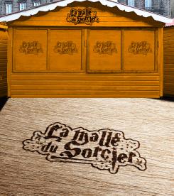
Little example of how the logo would look in use.
Logo for Harry Potter product stands
- Contest holder: RAM2014
- Category: Logo design
- Status: Ended
Start date: 12-09-2021
Ending date: 26-09-2021
It all started with an idea...
A short, interactive guide helped them discover their design style and clearly captured what they needed.
Brandsupply is a platform where creative professionals and businesses collaborate on unique projects and designs.
Clients looking for a new logo or brand identity describe what they need. Designers can then participate in the project via Brandsupply by submitting one or more designs. In the end, the client chooses the design they like best.
Costs vary depending on the type of project — from €169 for a business or project name to €539 for a complete website. The client decides how much they want to pay for the entire project.
Hello again bro! Here i tried to make logo a little bit less scary. Please let me know what do you think about this variant! :)
Hello RAM2014! Here is my logo proposal.
First of first i tried to make it a Harry Potter style logo, which i think i succeed in.
I have implemented some wizard and Harry Potter elements into the logo letters.
Also because your target audience are young and dreamy wizard people, there is
witch/wizard hat, a harry potter style magic wand, stars, harry potter owl and bats.
It is very catchy logo, and also it is readable from distance because that is very important.
Please leave me your feedback! Hope we can work this logo out together :)!
Hi Krsticcccccccccccc.
Thanks for your work.
It's nice for Halloween but it's too scary.
Thank you for reply, i will try to make it little bit less scary :)!
 Nederland
 België
 France
 Deutschland
 Österreich
 United Kingdom


