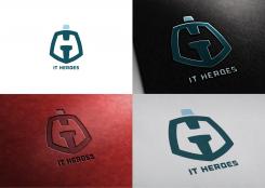
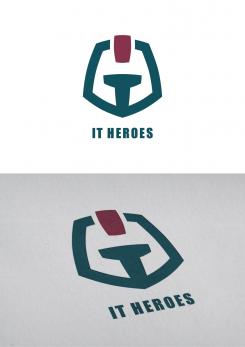
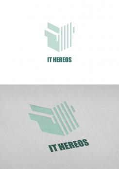
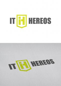
The logo is built out of the "i" and the "t" in a way, that the negative space between the characters shows on one hand a "H" and on the other hand a trojan helmet.
Logo for IT Heroes
- Contest holder: pitr
- Category: Logo design
- Status: Ended
Start date: 19-10-2013
Ending date: 16-11-2013
It all started with an idea...
A short, interactive guide helped them discover their design style and clearly captured what they needed.
Brandsupply is a platform where creative professionals and businesses collaborate on unique projects and designs.
Clients looking for a new logo or brand identity describe what they need. Designers can then participate in the project via Brandsupply by submitting one or more designs. In the end, the client chooses the design they like best.
Costs vary depending on the type of project — from €169 for a business or project name to €539 for a complete website. The client decides how much they want to pay for the entire project.
The Trojan helmet, that is formed out of the "IT" symbolizes on one hand the term "HERO" and on the other hand especially Trojans stands for subtle solutions (Trojan Horse). The blue-green stands for the technical skills and the dark red for the power and passion of your profession.
… in the negative space you can also see the "H".
Can you give me some Feedback I can work on to improve the logo?
Hi! I have a hard time pointing out what I like, so I best refer you to the 5-star logo's. In this specific logo, I can only see a man (red head) holding a T in his hands. Thanks for participating though!
Helmets like the following are the impression for that logo: http://bit.ly/trojan_helmet What about the helmet-concept itself. Should I work on this concept by fixing some details that it doesn't look like like a red head anymore? (Before you said it I never saw that red head …)
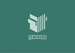
Visually I preferred to highlight the "IT". Because all in all the viewers clearly must see what's your profession. The "HERO" is symbolized by the form of a shield. The shield is formed out of the three-dimensional combination of the "IT". The 3D also tells the viewers that you are able the think in "more dimensions" to get the solution.
 Nederland
 België
 France
 Deutschland
 Österreich
 United Kingdom
