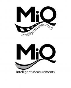
In this logo design again, I have used the typeface Humanist BT while distorting it bit from the original, so it becomes more interesting for the viewer.
In this design the terminal/hanger of the letter "Q" is connected with a stylized rail line (in the logo on top the rails are more visible but in on on the bottom creates a feeling of speed and precisio). The shape and form of the "rail line" gets the viewer to follow the design and the letters, which makes it more memorable and creative.
The colours used are black and grey, which makes the design simple, professional and serious, while the "rail line" makes it creative and flexible.
If you have any questions or suggestions, please let me know!
Best Regards,
Hristo
Logo for Measurement System: M-iQ Intelligent Measurements
- Contest holder: RicardoRail
- Category: Logo design
- Status: Ended
- Files: File 1, File 2, File 3
Start date: 19-10-2015
Ending date: 15-11-2015
It all started with an idea...
A short, interactive guide helped them discover their design style and clearly captured what they needed.
Brandsupply is a platform where creative professionals and businesses collaborate on unique projects and designs.
Clients looking for a new logo or brand identity describe what they need. Designers can then participate in the project via Brandsupply by submitting one or more designs. In the end, the client chooses the design they like best.
Costs vary depending on the type of project — from €169 for a business or project name to €539 for a complete website. The client decides how much they want to pay for the entire project.
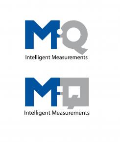
Here are two different versions of the same idea about the logo and the use of "negative space" for the connection of the letters while also putting the letter "i"
The colour schemeis the same as the previous logo, just the typefaces are a little bit different.
If you have any questions or suggesions, please let me know.
Best regards,
Hristo
In this logo I kept the design as simple as possible while keeping it professional and creative. This makes the logo easy to read and understand but also memorable and distingushable.
I altered the Humanist BT typeface, which is used by your company, just enough to make it more interesting and memorable while keeping it recognizible.
The colours I used for this logo design represent the professionality of the company. While the use of the "white space" and the letter "i" makes it more creative and engaging.
If you have any questions and suggestions, please don't hasitate to share them with me.
Best Regards,
Hristo
 Nederland
 België
 France
 Deutschland
 Österreich
 United Kingdom


