No comments
Logo for private real estate investor - real estate match maker for business project !
- Contest holder: BFI
- Category: Logo design
- Status: Ended
- Files: File 1, File 2
Start date: 22-11-2017
Ending date: 22-12-2017
It all started with an idea...
A short, interactive guide helped them discover their design style and clearly captured what they needed.
Brandsupply is a platform where creative professionals and businesses collaborate on unique projects and designs.
Clients looking for a new logo or brand identity describe what they need. Designers can then participate in the project via Brandsupply by submitting one or more designs. In the end, the client chooses the design they like best.
Costs vary depending on the type of project — from €169 for a business or project name to €539 for a complete website. The client decides how much they want to pay for the entire project.
No comments
super
Bonsoir,
Nous avons réouvert le concours car nous avons eu beaucoup de travail et pas le temps gérer les retours pour les designers la 1ère fois.
Votre logo nous a plu mais quelques modifications sont nécessaires :
1. Faire une proposition de logo à l'horizontale. Ce sera la version la plus utilisée bien que la version verticale compte aussi.
2. Peut-on rajouter l'idée d'une ampoule en stylisant la serrure ? Cela ferait moins premier degré et ajouterait une signification supplémentaire.
3. Certains ont trouvé que les bulles ne s'échappaient pas assez pour faire penser à des projets qui se libèrent, comme c'est notre volonté première.
4. Peut-on personnaliser un peu plus la typographie ? En intégrant l'illustration dedans ou en changeant la police de caractère peut-être ?
Merci pour ces premières modifications. Nous vous tiendrons informé.
-------------------------
Good evening,
We reopened the contest because we had a lot of work and no time managing the returns for the designers the 1st time.
Your logo pleased us but some modifications are necessary:
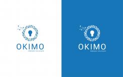
1. Make a logo proposal horizontally. This will be the most used version although the vertical version also counts.
2. Can we add the idea of a bulb by stylizing the lock? This would make less first degree and add extra meaning.
3. Some have found that the bubbles do not escape enough to think of projects that are released, as is our first wish.
4. Can we customize the typography a bit more? By embedding the artwork in or changing the font maybe?
Thank you for these first changes. We will keep you informed.
Dear, thank you very much for your comment. I will work on your suggestions and set up to look.
Greetings
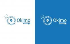
Dear, I worked on your suggestions. I make a logo horizontally. I stylizing the lock to also be bulb, I make to bubbles more escape and for font i use Roboto and add cable on letter i. What do you think of my new proposal? Do you have any suggestion to improve my work?
Greetings
Hello tennisloool and thanks for your new suggestion! Here are our remarks :
1. Bubbles are better now.
2. We don't like very much the power outlet that comes out of the letter I. It's less modern. Perhaps you can work more on the font instead of add another illustration ?
3. Could you stylize the bulb in another way ? For example, instead of the bold thread inside the bulb, we can imagine you just put 2 or 3 stylised line for example to look more like it's shining inside you know, and make them thin, that shouldn't be the first image people see.
4. Can you try to put the circle at the beginning of Okimo just for seeing how it looks like ? But it's important we still understand the entire word is Okimo and not just Kimo, so I don't know if it will render well, it's up to you.
Have a good weekend
Dear, , thank you very much for your suggestions.
In the first two proposal I make new proposal for bulb. In the third proposal I use your suggestions 2 stylised line that shining inside. I used other fonts without illustration. I also put logo in Okimo.
Do you have any suggestions?
Have a good weekend also
 Nederland
 België
 France
 Deutschland
 Österreich
 United Kingdom
