Beste Adri?
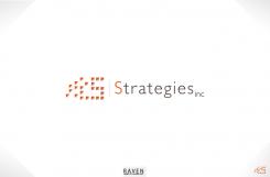
I want to show you my design for your company logo.
It is simple, classic , has a clean and professional look.
The parts combine into the letter S. I based this on the work you do for clients. You combine, join and unite into a structured whole. The logo does the same!
I am looking forward to your feedback.
Yours sincerely,
Ko-Lin
Logo for small strategy consulting firm
- Contest holder: Adri.Kraa@gmail.com
- Category: Logo design
- Status: Ended
Start date: 23-08-2012
Ending date: 06-09-2012
It all started with an idea...
A short, interactive guide helped them discover their design style and clearly captured what they needed.
Brandsupply is a platform where creative professionals and businesses collaborate on unique projects and designs.
Clients looking for a new logo or brand identity describe what they need. Designers can then participate in the project via Brandsupply by submitting one or more designs. In the end, the client chooses the design they like best.
Costs vary depending on the type of project — from €169 for a business or project name to €539 for a complete website. The client decides how much they want to pay for the entire project.
Hi Ko-Lin,
Thanks for this contribution. I am really happy that you think along with us, explain your thinking and that your design is based on our vision on strategy consulting. That makes it more specific to our little company. Great!
From a visual perspective I would like to see some further ideas. I Can see the letter S but can't make out what the little triangles on the right represent. Also why is the S of the full word in a different colour than the rest - is it more important or..? In that case would you not use the 'dotted S' as the first letter of the word Strategies?
Lastly, i don't think that the word "inc." should be smaller in size as then it could represent the legal from of our company (which it isn't). STRATEGIES INC.
(with the dot) is a name as a whole
 Nederland
 België
 France
 Deutschland
 Österreich
 United Kingdom

