The thickness of the lines can be changed.
White space between the lines is transparent.
Logo for the detsination CANADA
- Contest holder: alexabeckord
- Category: Logo design
- Status: Ended
Start date: 28-11-2012
Ending date: 16-12-2012
It all started with an idea...
A short, interactive guide helped them discover their design style and clearly captured what they needed.
Brandsupply is a platform where creative professionals and businesses collaborate on unique projects and designs.
Clients looking for a new logo or brand identity describe what they need. Designers can then participate in the project via Brandsupply by submitting one or more designs. In the end, the client chooses the design they like best.
Costs vary depending on the type of project — from €169 for a business or project name to €539 for a complete website. The client decides how much they want to pay for the entire project.
If you perhaps would like to see any variations in colour or stroke, I'll be happy to hear from you.
Kind regards
... or with another type of moose head...
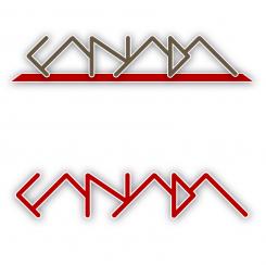
Here's something totally different.
I believe that this abstract approach supports your need for a cool & pure logo.
Variations in shape, colour and outline/shadow are possible, with or without the 'ground' the logo stands on in the first variation.
I'd like to hear your thoughts about this logo!
Kind regards.
Hi,
as you can see I made some adjustments: I replaced the maple leaf by a (abstract) moose and changed the colour of the inner circle into khaki. I also added some depth to that inner circle.
These changes leed to a more dynamic design in my opinion.
The word 'destination' was replaced by 'canada'.
I hope these changes meet up to your expectations.
If you want me to do some other alternations, I'll be happy to hear from you.
Kind regards.
The circle symbolises the endless possibilities to travel in Canada.
The color red and maple leaf speak for themselves. Even without the text, people will know that this logo represents Canada.
Looking forward to your feedback...
Thanks, it's a good start. The logo does not necessarily need to include the word destination, but it would be OK as well.
Any variations possible here? May be also in colour?
Thanks!
 Nederland
 België
 France
 Deutschland
 Österreich
 United Kingdom
