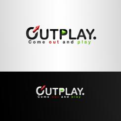
Hey :) desc. the represents the new a little bit modified symbol for men which has a connection with the frase OUT because the arrow is leaving the letter O the P letter has the PLAY symbol in it, and has a connection with the word PLAY. hope you like it ;)
Logo heterofriendly gayparty "OUTPLAY." (+ follow up task)
- Contest holder: nse88
- Category: Logo design
- Status: Ended
Start date: 20-02-2013
Ending date: 06-03-2013
It all started with an idea...
A short, interactive guide helped them discover their design style and clearly captured what they needed.
Brandsupply is a platform where creative professionals and businesses collaborate on unique projects and designs.
Clients looking for a new logo or brand identity describe what they need. Designers can then participate in the project via Brandsupply by submitting one or more designs. In the end, the client chooses the design they like best.
Costs vary depending on the type of project — from €169 for a business or project name to €539 for a complete website. The client decides how much they want to pay for the entire project.
"the letter O"* in the first sentance (made a mistake) XD
Hey Faust, thanks for participating! We like the creativity and story behind the logo. Concerning the 'O' we like the meaning of getting 'out', but we don't like so much the meaning of 'men' as we are also a party for women ;-)
Suggestions to improve: switch the colors red and green: arrow green and play sign red and also the words 'out' and 'play' in the pay off. And also, try to experiment with an other font and/or other colours. Good luck!
thnx ;) will work more ;)
Nice, very curious about your next work! :-)
 Nederland
 België
 France
 Deutschland
 Österreich
 United Kingdom

