No comments
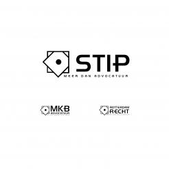
Logo new lawyers office
- Contest holder: GTP
- Category: Logo design
- Status: Ended
Start date: 20-12-2016
Ending date: 26-01-2017
It all started with an idea...
A short, interactive guide helped them discover their design style and clearly captured what they needed.
Brandsupply is a platform where creative professionals and businesses collaborate on unique projects and designs.
Clients looking for a new logo or brand identity describe what they need. Designers can then participate in the project via Brandsupply by submitting one or more designs. In the end, the client chooses the design they like best.
Costs vary depending on the type of project — from €169 for a business or project name to €539 for a complete website. The client decides how much they want to pay for the entire project.
No comments
Dit logo overtreft o.i. alle voorgaande. De witrand om de oranje stip is erg goed gevonden. Wij zijn erg benieuwd naar variaties hiervan voor andere namen met en zonder logo.
Dear GTP,
Thank you for your constructive feedback and rating.
In this design you can see infinity symbol or/and group of 3 people wich symbolise tougether workships, support and continuity with god jobs.
I think it is also memorable and attractive to people.
Hope that you like it.
Best xmas regards,
m3kdesign
Thank you very much for you swift reply and your quick new logo's. The 2nd one has maybe too much colors in our opinion and is still too "mathematical", but this last one we really like.
What is the meaning of the infinity logo in this respect?
Instead of three dots on top of the infinity sign, maybe, just one would be better?
Thanks you again !
I will create for you something different also. The infinity sign symbolizes infitive and unselfish support for your customers. I will edit the current logo and keep only one dot on the top of the infinity sign. Thank you once again for your feedback.
Hi!
Here is my vision about your company.
If you have some suggestions, please be free to contact me.
Hope that you like it.
Best regards,
m3kdesign
Thank you ! Nice that you made the logo for three names and the style looks good on each of them. In general we find the style too "mathematical" and too little colorful. I hope you could do something with this. Thank you very much !
 Nederland
 België
 France
 Deutschland
 Österreich
 United Kingdom
