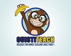
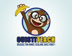
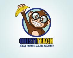
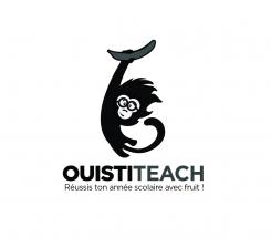
Oh and ive made with one with some teeth again, but these are more angular. Which should get rid of that tense feeling.
LOGO of a MONKEY who proudly holds a BANANA
- Contest holder: Big Ben Junior
- Category: Logo design
- Status: Ended
Start date: 10-08-2015
Ending date: 31-08-2015
It all started with an idea...
A short, interactive guide helped them discover their design style and clearly captured what they needed.
Brandsupply is a platform where creative professionals and businesses collaborate on unique projects and designs.
Clients looking for a new logo or brand identity describe what they need. Designers can then participate in the project via Brandsupply by submitting one or more designs. In the end, the client chooses the design they like best.
Costs vary depending on the type of project — from €169 for a business or project name to €539 for a complete website. The client decides how much they want to pay for the entire project.
Hi thank you for your feedback. I actually quite liked the big smile, and you mentioned you liked it too. I think it gives him some character and makes him stand out. But anyway, I gave him a different more normal looking mouth. Still a big smile though.
Here you go.
Thank you for your work ! Because of the outline now the letters are too close to one another. Could you add an espace between letters like in the previous proposal ? I also have an other problem with your logo. I've introduced it to my friends and they have a mixed feeling about it because of its smile. Could you present me the same logo and the same monkey but with a totaly different smile ? An happy smile which gives to the monkey a funny expression but without all these tooths which give to the monkey a tense expression. Thank you ! :)
Here are the adjustments. See it in full view if you click on the image.
Awesome, good job ! Could you also add a black outline to the brand name ? And fix the typo error in the slogan (Réussis, you forgot the 'R'). Thank you !
A different option.
Thanks but I prefere the first vesion with the circle.
So I decided to start with a new design again. A new monkey. Hopefully is getting closer to what you are looking for. Ive kept the big smile. Added some glasses but changed the design and color.
Thanks, I really like this version. Your monkey is cute, funny, intelligent and original, good job ! However I have some suggestions in order to improve it. I don't like the angular-shape of his arm, can you rework on it ? The banana is blurred and lacks of finish touch. Also, could you write "Ouisti" in blue (the blue use for the outline of the cercle) and "teach" in yellow (the yellow used for the banana). I would like to avoid this orange color. Thank you :)
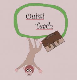
And here is completely different monkey. A little slimmer and looks a bit more like a student monkey.
I dont like very the color of your monkey. Also your monkey has a sad expression because of the eyebrow on the right. I prefere the big smile version !
Heres number two.. a slighty different look.
With some glasses
I dont like this color scheme and I prefere the originality of the previous version. I invite you to work on the improvement of the previous monkey.
Hello, so I've been working on the monkey. In fact I've been working so hard on these monkeys.. Im starting to hate monkeys.. But that's a different story. So Im about upload a few designs.. Two different styled monkeys.
Thank you for your incredible work ! This version is my favorite, I like his big smile :D I hope you have still energy and dynamism to work on it, because I need you to improve it ! First I dont like this green outline. Could you replace it by a black color, or simply remove this outline ? Second I would like you to add an accessory to the monkey to give him an intelligent appearance, for example big eyeglasses. Also, fix the name of the brand, it is "Ouistiteach". Good luck, your logo has a lot of potential :)
Hi, this is my first proposal. If you like the design I could present a few options with different color schemes.
You can click on the image to see it in full view
Hello Abyss27, thank you for your work ! I really like the design style of your monkey, he seems in very good shape :) I invite you to show me a few options with different color schemes to get a better idea of the potential of your logo. However I have 2 recommandations for you to improve it. First, your monkey seems a little bit sad, anxious, idk maybe it is because of the eyebrow. Can you make him more happy, enjoying live with his banana ? The other remak concerns the dimension of the monkey. I need a more balanced proportion between lenght and width. Can you fix that ? Thank you, good luck !!
 Nederland
 België
 France
 Deutschland
 Österreich
 United Kingdom
