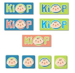
Tweede idee:
De 'O' versterken door er een gekleurd rondje achter te plaatsen. Dit zorgt ook voor een kleurrijkere Favicon.
Mocht u het ontwerp in andere kleurstellingen willen zien is dit mogelijk.
Logo software childcare
- Contest holder: Fortega
- Category: Logo design
- Status: Ended
Start date: 03-08-2012
Ending date: 31-08-2012
It all started with an idea...
A short, interactive guide helped them discover their design style and clearly captured what they needed.
Brandsupply is a platform where creative professionals and businesses collaborate on unique projects and designs.
Clients looking for a new logo or brand identity describe what they need. Designers can then participate in the project via Brandsupply by submitting one or more designs. In the end, the client chooses the design they like best.
Costs vary depending on the type of project — from €169 for a business or project name to €539 for a complete website. The client decides how much they want to pay for the entire project.
Hi!
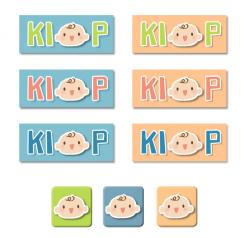
Here is my first idea for Kiop.
I chose to use a child's cute head as the letter o. The font is playful with bright colors. I used different color schemes to create an overview of what different colors could do for the logo and android app favicon.
I would be happy to receive your feedback.
 Nederland
 België
 France
 Deutschland
 Österreich
 United Kingdom


