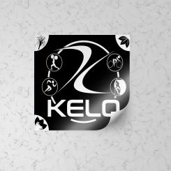
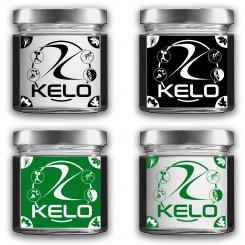
sticker label mockup example
Looking for graphic elements for fitness tea
- Contest holder: Martin Gangl
- Category: Logo design
- Status: Ended
- Files: File 1, File 2
Start date: 19-04-2021
Ending date: 26-04-2021
It all started with an idea...
A short, interactive guide helped them discover their design style and clearly captured what they needed.
Brandsupply is a platform where creative professionals and businesses collaborate on unique projects and designs.
Clients looking for a new logo or brand identity describe what they need. Designers can then participate in the project via Brandsupply by submitting one or more designs. In the end, the client chooses the design they like best.
Costs vary depending on the type of project — from €169 for a business or project name to €539 for a complete website. The client decides how much they want to pay for the entire project.
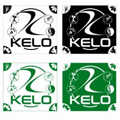
The graphic study of this label highlights your logo in the center, which in turn is in the center of a circle where 4 sports images appear on the left and right sides (a weight lifting, a runner, a cyclist, a climber) . In the extreme right and left corners at the top and bottom I have inserted 4 standard images that contain most of your ingredients (Green tea,
mate, Oolong tea, lemongrass, nettle, ginger root, Rooibos, mint, cinnamon
Thank you for your idea Fabizio! The circle is almost too narrow for me and a little too much with the illustrations. Please play with the circle and the symbols. It would be great if you could see slightly transparent leaves on the black background. Kind regards, Martin
Thanks Martin for your information. Now I try to better modify this label. See you soon. Regards. Fabrizio
 Nederland
 België
 France
 Deutschland
 Österreich
 United Kingdom


