No comments
Manufacturer of high quality design furniture seeking for logo design
- Contest holder: designkonsulat.de
- Category: Logo design
- Status: Ended
- Files: File 1, File 2, File 3
Start date: 02-10-2017
Ending date: 16-10-2017
It all started with an idea...
A short, interactive guide helped them discover their design style and clearly captured what they needed.
Brandsupply is a platform where creative professionals and businesses collaborate on unique projects and designs.
Clients looking for a new logo or brand identity describe what they need. Designers can then participate in the project via Brandsupply by submitting one or more designs. In the end, the client chooses the design they like best.
Costs vary depending on the type of project — from €169 for a business or project name to €539 for a complete website. The client decides how much they want to pay for the entire project.
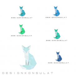
Thank you for your notes and your encouragements, I colorized the logo with various variants of blue and green as to ask previously. I'm at your disposal. Cordially.
Ludo.
No comments
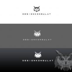
The owl also looks pretty cool! Could you please revise the owl in the same way as the fox in terms of colour and shape? Thanks!
No comments
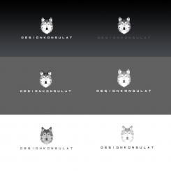
A wolf also instead of the fox can return the attractive logo.
The wolf does not really fit, sorry.
No comments
I have to kidnap the reindeer to put it a fox. When think you?
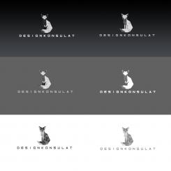
Hi, we like this one the most because it looks really cool! The best one is in our perception the fox in the left bottom corner. The plain black and white look is already great but we think that some color would be perfect for this design. We prefer the colours green and blue. Can you revise the fox and colour it in different shades of green and blue? [Just one colour (green or blue) in different shades in one design]
Maybe the triangle structure can also be simplified a bit to get less small triangles. But please simplify only as far as the charisma does not change because this is waht we really like about it. Thanks for your efforts!
Regards
No comments
Hi, thanks for your design. We like the font you choose, but the deer is a bit to stereotype for the region in our perception. Could you please try again with another animal? Thanks!
Hello and thank you for your remarks. I am going to keep this police of writing and to put another animal. Have you an animal rather?
Ludo.
 Nederland
 België
 France
 Deutschland
 Österreich
 United Kingdom
