No comments
Modern logo for national company 1 op 1 autotheorie nl
- Contest holder: cherms
- Category: Logo design
- Status: Ended
- Files: File 1
Start date: 24-07-2020
Ending date: 24-08-2020
It all started with an idea...
A short, interactive guide helped them discover their design style and clearly captured what they needed.
Brandsupply is a platform where creative professionals and businesses collaborate on unique projects and designs.
Clients looking for a new logo or brand identity describe what they need. Designers can then participate in the project via Brandsupply by submitting one or more designs. In the end, the client chooses the design they like best.
Costs vary depending on the type of project — from €169 for a business or project name to €539 for a complete website. The client decides how much they want to pay for the entire project.
here are some other variations from me. please let me know what you think of it, any feedback will be appreciated
No comments
The idea is a collaboration of teacher and student in learning about driving symbolize by letter shaped like a steering wheel, with handshake in a middle
here are the revision of the previous design.
please let me know what you think
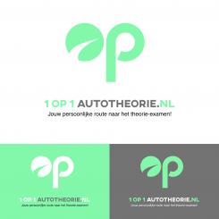
The idea behind this logo is to make a logo with the least intimidating feeling as possible. The logo only consists of two circles, one rectangle and one arch. Which will make the logo look simple and approachable.
I only use a soft turquoise and light gray to enhance the calming effect for the logo.
Nice! Thank you. Could you use #73d5b8 and black?
 Nederland
 België
 France
 Deutschland
 Österreich
 United Kingdom
