No comments
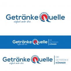
Modernization of our logo
- Contest holder: Getränke Quelle
- Category: Logo design
- Status: Ended
- Files: File 1
Start date: 26-11-2020
Ending date: 10-12-2020
It all started with an idea...
A short, interactive guide helped them discover their design style and clearly captured what they needed.
Brandsupply is a platform where creative professionals and businesses collaborate on unique projects and designs.
Clients looking for a new logo or brand identity describe what they need. Designers can then participate in the project via Brandsupply by submitting one or more designs. In the end, the client chooses the design they like best.
Costs vary depending on the type of project — from €169 for a business or project name to €539 for a complete website. The client decides how much they want to pay for the entire project.
No comments
silahkan cek ..
salam fabian.
We held a conference and we think it still doesn’t look really modern.
It looks like a logo from the 80ies or 90ies.
Please try something else.
Surprise us.
No comments
check please..
greetings fabian.
No comments
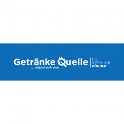
Is this what you are asking for ... if you need a revision don't hesitate to let me know ...
greetings Fabian 1 ..
Hello Fabian, thank you very much. That looks good.
Because we use and want to use our logo on a blue background, we'd like to see a white bottle inside the Q (on the blue background).
I would be good to see the end of the bottle turning into the Q's "line".
Could you put the slogan "... einfach mehr drin" more to the right? So its' end is where the crown cap starts.
Kind regards
of course you can, I'll do it right away ...
greetings fabian1 ..
No comments
please check...
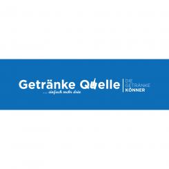
We prefer the first one.
Please edit your first design again:
- take the font for "... einfach mehr drin" from your newest design
- maybe the bottle inside the crown cap could become the the line of the Q?
i will revise what you ask ..
thanks.
No comments
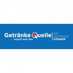
We prefer the one from before...
Maybe a bottle (without the blue line inside) in a less detailed crown cap?
 Nederland
 België
 France
 Deutschland
 Österreich
 United Kingdom
