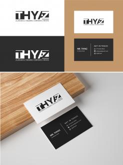
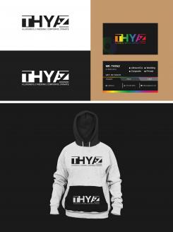
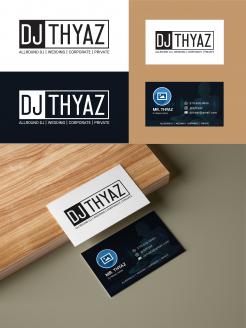
Please have a look... I have updated the business card as you told. Please let me know your opinion. Thank you
new Logo and business cards design for a DJ
- Contest holder: Thyaz
- Category: Logo design
- Status: Ended
Start date: 24-09-2021
Ending date: 01-10-2021
It all started with an idea...
A short, interactive guide helped them discover their design style and clearly captured what they needed.
Brandsupply is a platform where creative professionals and businesses collaborate on unique projects and designs.
Clients looking for a new logo or brand identity describe what they need. Designers can then participate in the project via Brandsupply by submitting one or more designs. In the end, the client chooses the design they like best.
Costs vary depending on the type of project — from €169 for a business or project name to €539 for a complete website. The client decides how much they want to pay for the entire project.
Please let me know your opinion if you want any updates or changes... Thank you.
Hi!
Thanks for submitting. Logo looks good! wouldn't change that anymore. Jumps into my top 3.
If I would change something, it would be the business card.
Not the biggest fan of the design/colors used in the front.
The backside is too busy for me. Also not a fan of the 4 wedding corporate etc boxes. For me, it's not needed to write that again on the back, because it's part of the logo in the front. Less is more.
Your 'get In touch' mark is something genius! Simple, but very clear and effective. Well done with that.
in overall: if you can redesign the business car (with the same front logo ofc) this is a very very good one. Thank you
Design updated...please have a look and let me know your opinion. Thank you
 Nederland
 België
 France
 Deutschland
 Österreich
 United Kingdom


