No comments
New logo for assortment gardenening products
- Contest holder: fetim
- Category: Logo design
- Status: Ended
Start date: 15-05-2012
Ending date: 04-06-2012
It all started with an idea...
A short, interactive guide helped them discover their design style and clearly captured what they needed.
Brandsupply is a platform where creative professionals and businesses collaborate on unique projects and designs.
Clients looking for a new logo or brand identity describe what they need. Designers can then participate in the project via Brandsupply by submitting one or more designs. In the end, the client chooses the design they like best.
Costs vary depending on the type of project — from €169 for a business or project name to €539 for a complete website. The client decides how much they want to pay for the entire project.
No comments
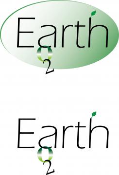
I tried with H2O. I think it's better with transparent 2O because people will think that the name is EartHO, ( instead of just Earth ) if you agree. Hope you like it.
No comments
Oasis... I think Earth is better
No comments
This one is better. The O2 gives some distinct. Would the combination Earth2O (Earth and H2O (water)) work you think?
Or EartH20
I agree with that idea EartH20.I'll do it.What about font type?Do I need to change that?
No comments
Hi Jelenica, Thanks for your entries. Can you explain the O2? The font type is too shallow I think.
I can change the font if it would be better.O2 is oxygen , couse I think it is related to garden and plants in general. I was thinking between O2 and H2O so I can do with H2O if you like it.
 Nederland
 België
 France
 Deutschland
 Österreich
 United Kingdom
