No comments
New Logo, online 3D printing service
- Contest holder: john.tillema
- Category: Logo design
- Status: Ended
- Files: File 1
Start date: 08-03-2013
Ending date: 15-03-2013
It all started with an idea...
A short, interactive guide helped them discover their design style and clearly captured what they needed.
Brandsupply is a platform where creative professionals and businesses collaborate on unique projects and designs.
Clients looking for a new logo or brand identity describe what they need. Designers can then participate in the project via Brandsupply by submitting one or more designs. In the end, the client chooses the design they like best.
Costs vary depending on the type of project — from €169 for a business or project name to €539 for a complete website. The client decides how much they want to pay for the entire project.
No comments
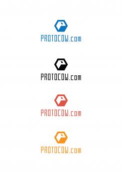
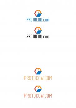
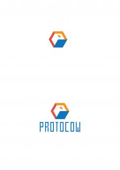
Here is my solution for 3D printing. I read what you wrote and I tried to do as you like. I put the two colors, orange and ocher to fitted in perfectly with blue that represents shadow of a cube. Ochre represents brightest cube surface, the surface where the sun first comes a little orange and darkened surface of the cube. I chose these colors because they are the thankfulest to work, modern and very nice they look together. I used a font that is Mecha Condensed! I chose it because it fits perfectly into a cube, it has a a cubical endings, it is simple and easy to read. Of course I compared this with the font for your Basicl.
There are also several versions of the color and typography, for better visibility.
No comments
Dear Radomir,
First of all we would like to compliment you for your work in effort to visualize our demands. We discussed your logo and we came up with a few comments.
We all liked the multi-color (CMYK) option of the logo, since we want to reach out to different stakeholders in the 3D printing business. Jet this multi color approach puts us in a bit of a difficult position. We would like to see each different stakeholder (with it’s own color) represented in our logo. Could you give us some options in which you show us a general logo that reaches out to ALL the stakeholders. It’s up to you to choose whether you want to multiply the cube or combine the colors in a single cube. Surprise us. You are the designer! ☺
We would also like you to give us some options regarding:
• Textplacement
• Please use .com in the text
• Leave out reflection underneath the letters
• Use of color
No comments
Nice direction, could you maybe still fill the solid color, and make the lines of the cube this thin, so some kind of combination with the previous and this one?
No comments
Like them a lot! Very clean and simple! Could you use it with the delivered lettertype logo? (maybe make it a little bit thinner?)
you think to find a different font for the logo?
Sure, but we really really like de BASICL thin, technical font. http://www.dafont.com/basicl.font
ok i will try! :)
 Nederland
 België
 France
 Deutschland
 Österreich
 United Kingdom
