No comments
ONE PERCENT CLOTHING Your Favourite Artists Wear
- Contest holder: OnePercentClothing
- Category: Logo design
- Status: Ended
Start date: 02-04-2019
Ending date: 09-04-2019
It all started with an idea...
A short, interactive guide helped them discover their design style and clearly captured what they needed.
Brandsupply is a platform where creative professionals and businesses collaborate on unique projects and designs.
Clients looking for a new logo or brand identity describe what they need. Designers can then participate in the project via Brandsupply by submitting one or more designs. In the end, the client chooses the design they like best.
Costs vary depending on the type of project — from €169 for a business or project name to €539 for a complete website. The client decides how much they want to pay for the entire project.
No comments
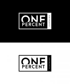
Here i added "clothing" and made it more like a label.
No comments
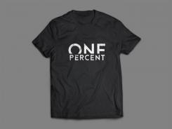
In this one I purely used typo without a symbol. Looks pretty tight i think. Regards Mike.
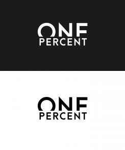
I really appreciate your time Mike. I'm very interested in your ideas so far. I think this is the logo I like the most. There's only one thing that keeps coming to my mind. I'm affraid people will read this as ONF PERCENT. Is there any possibility that your can make it a little more look like an E?
No comments
Hi, I made two new versions after your feedback. Less is more... Thus i left the 1 out in this one.
No comments
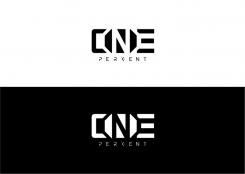
Hello here is my logo in black and white. I used the symbols of the words in de typography. 1 in the "N" en the % in the second "N". Hope you like it. Best regards, Mike
Hi Mike, thanks for your quick respons. Really appreciate it and really like the idea so far. I think the 1 in the "N" is already too much. Would really appreciate it if you could make a version without the "1" in the N!
 Nederland
 België
 France
 Deutschland
 Österreich
 United Kingdom
