12. Blue2
Piano Couture Logo + header + suitable font en color-lay-out / background for homepage.
- Contest holder: coenm
- Category: Logo design
- Status: Ended
Start date: 03-01-2013
Ending date: 17-01-2013
It all started with an idea...
A short, interactive guide helped them discover their design style and clearly captured what they needed.
Brandsupply is a platform where creative professionals and businesses collaborate on unique projects and designs.
Clients looking for a new logo or brand identity describe what they need. Designers can then participate in the project via Brandsupply by submitting one or more designs. In the end, the client chooses the design they like best.
Costs vary depending on the type of project — from €169 for a business or project name to €539 for a complete website. The client decides how much they want to pay for the entire project.
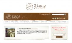
9. - Cheerful open beige - also inspired by the colors in Ray's movie
Wow, nice.
we're getting really really close with these last two. let me 'let them sink in' for a bit. I'll get back to you tomorrow when I look at them again and let you know if I might know the final minor finishing touch. Might be nothing,..
Just to check: I have very nice picture of some keys myself, might it be possible to replace your transparent background-piano picture with mine and use that one in stead on either one of these last two designs?
Truly love them both, hard to say which one I like best out of these last two right now.
Thanks so much!
I'm glad you like it :)
As for the picture - of course it can be replaced with any other of your pictures.
Regards
SteSa
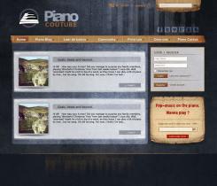
8. Warm Blue - Inspired by the colors in Ray's movie
wow. Nice. :)
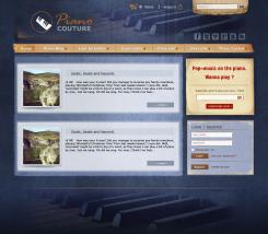
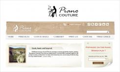
7.b - Brown grunge header - Logo version 2
Hi,
Thanks for grate feedback !
I hope I understood you well in terms of what you liked from my designs. So therefore I have made new combinations , hoping that you will like this new .
Regards
SteSa
Again, truly great tries! thanks so much.
Thing is, I'm getting a little bit of a 'dark' 'underground' even 'uninviting' / 'scary' feel from all of them (especially with 7). Could you add in some 'kind' 'fresh' and 'inviting' 'everybody's welcome and should join' feel? Or am I being way to vague saying this?
Also please leave out the 'jazzy poppy... ' text, if you're going to re-try on the 7a and 7b.
At this point I like version 6a and 6b best.
7a I don't really feel the 'swirl' keys in the logo.
7b I like, but the 'saw (movie)-feel' 'uninviting' etc... is highest with this one.
Really liking your tries, you're my number one at the moment.
Thanks so much.
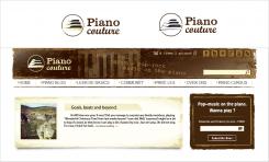
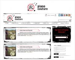
6.b - White old-paper bg - Logo design: version 2
6.a - White old-paper bg - Logo design: version 1
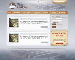
5.Light version
Like this one the least, altough it's nice to, it's to 'neat'.
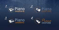
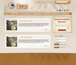
4. and 3. I like best, but are also too 'neat'. If you'd be so kind to try again, maybe mix the 'filth' / 'rugged' feel of 1 and 2 with the vintage vibe of 4. and 3.
Love your tries, thanks very much.
4.Brown-light version
Very nice tries! I like different parts from different ones though :).
This one I like the logo from (though it might still be a bit too classical, because of the grand piano and also the font in the newsletter). Maybe you could take a look at poppy and his last design for my contest and take some inspiration from that. I like his 'piano keys' in the logo.
If you'd be so kind, loose the 'swirling' notes in the header. I'd like to have no reference to sheet music whatsoever.
The headers in all your tries lack something though. I like the overall feel, but headers need some adaption (do like the 'arrangement and the Facebook/twitter etc. icons on most
Thanks so much for a great try!
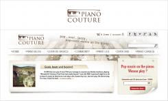
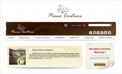
3.Brown version
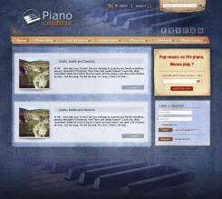
like the colours on this one! (like the overall feel of this one as well). Also the logo, but this is too classical too. twit/facebook etc. icons great. newsletter great.
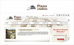
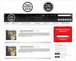
2.Black-white version
like the shadows on post previews and the fact that newsletter stands out.
like the shadows on post previews and the fact that newsletter stands out.
 Nederland
 België
 France
 Deutschland
 Österreich
 United Kingdom
