Hello,
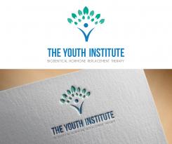
I made another design option. Making the symbol of a health and a person inspired by the health symbol - Caduceus.
Regards,
Zane
Please be the artist that brands "The Youth Institute"
- Contest holder: geo_valy
- Category: Logo design
- Status: Ended
Start date: 03-02-2016
Ending date: 10-02-2016
It all started with an idea...
A short, interactive guide helped them discover their design style and clearly captured what they needed.
Brandsupply is a platform where creative professionals and businesses collaborate on unique projects and designs.
Clients looking for a new logo or brand identity describe what they need. Designers can then participate in the project via Brandsupply by submitting one or more designs. In the end, the client chooses the design they like best.
Costs vary depending on the type of project — from €169 for a business or project name to €539 for a complete website. The client decides how much they want to pay for the entire project.
Hello,
I created design where the main element is icon made from the letter Y - for youth , creating negative space an being enclosed by sprouts to symbolise youth and energy.
I used vibrant green colours so the colour scheme would be positive and energetic.
I made two versions of the same design, let me know which colour scheme would you prefer.
Looking forward to hearing from you,
Regards,
Zane
Hello,
I made another design option using the icon of a person.
To keep clean and more professional I used only 2 colour schemes. I made the name of institution bold and the subtitle with complimentary font.
At the last example you can see even a little bit bolder font for subtitle, if you feel that maybe this one could be too soft.
Looking forward to hearing from you,
Best Regards,
Zane
Hello,
I created bright and meaningful logo for this institute. I made the abstract figure of a man as and staring point of a tree - that symbolises growth, youth, health and good spirit.
The colour scheme I kept blue and green as explained in the brief.
I made the name of company bold and outstanding and subtitle settle, clean and professional.
Looking forward hearing from you,
Best Regards,
Zane
 Nederland
 België
 France
 Deutschland
 Österreich
 United Kingdom
