No comments
Raise together
- Contest holder: RAISETOGETHER
- Category: Logo design
- Status: Ended
- Files: File 1, File 2
Start date: 02-04-2016
Ending date: 07-04-2016
It all started with an idea...
A short, interactive guide helped them discover their design style and clearly captured what they needed.
Brandsupply is a platform where creative professionals and businesses collaborate on unique projects and designs.
Clients looking for a new logo or brand identity describe what they need. Designers can then participate in the project via Brandsupply by submitting one or more designs. In the end, the client chooses the design they like best.
Costs vary depending on the type of project — from €169 for a business or project name to €539 for a complete website. The client decides how much they want to pay for the entire project.
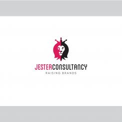
Hello @RAISETOGETHER , according your recent feedbacks, here is another design based on the lion with much more with colors and shapes. That said I think a consultancy brand need also to feel corporate & serious.
I can make other variations if it goes in the right way.
@RAISETOGETHER Another layout for font.
lion beautiful. cap effect not the best. miss the humor.
@RAISETOGETHER As you asked, here is a version with the lion between the two words
i prefer 2-colored lion on the left
@RAISETOGETHER, according your second brief, i have mage this simple font/logo. Color can be easily changed as you wish.
thank you. a lot of color, and the lion got lost. I miss therefore the lively, happy effect.
@RAISETOGETHER, here is another design with initials.
No comments
Good work!
Please read the below and see if you can further improve your design. I am interested to understand your thinking behind the choice of colors.
Dear Design Team,
Thanks very much for your participation and creative work so far!
Based on all designs reviewed so far, and some new inspiration I got, I have made the following decisions:
1) The subtitle will become ‘raising brands’ instead of spotlighting brands. Although I like ‘spotlighting brands’ as well, this matches better with the website that I will use which is called: ‘raiseyourbrand.nl’.
2) Since I will use this website name, the prominent term ‘JC’ in the logo does no longer make sense. I still would like to use ‘Jester Consultancy’ in words, because that’s the name of my company and carries the creative angle of the Jester. Raise your brand is that what I’d like to achieve with companies.
For now I’d like to proceed with 2 scenario’s:
Scenario 1: Design of Mosby
a. Pro’s: Jester is mirroring the King, The King’s crown could also be people who are moving/dancing in a circle, it could also be a seesaw (finding balance and/or childgame), it’s easy to understand, accessible design, humorous, dynamic, strong. I also like the font type of Jester Consultancy and its subtitle.
b. Tips for improvement:
i. Experiment with use of colour. Pink is not a necessity. Better to express the following with a colour: Dutch roots, world citizen, energy, both feet on the ground, friendly, open, warm (NOT agressive)
ii. Will the grey font color be readable enough on every communication touchpoint?
iii. Could the design become more integrated, more unified and if possible, even more minimalistic?
Scenario 2: New design based on a variety of nice design elements received from different designers.
- The Concept: Lion with manes looking like a jester.
- Integrated design. Could the lion become part of the name Jester Consultancy so it becomes one logo and not a picture plus words?
- Mimimalistic, clean, professional design (both image and font type) of the ‘JC’ design of LOGOMAN
- Font size: like design of Mosby
- Smiling lion: the lion received from ANA-DESIGN I like the best because of it’s friendly appearance, however I do not like the many, many details in the image. Please keep it simple.
- Jester cap: it has to have bells to differentiate from a normal lion. You may want to experiment with coloured bells like designer TJARDA did, however it should still be professional and not a circus.
- Jester cap: Ideally – in this scenario - it has 4 bells in total. Like THE ONTWERPER
Minimalistic design please, however still recognizable as a jester cap.
- Make sure the design has a strong stand-out.
- Feel free to experiment with colours. Pink is not a necessity. Better to express the following with a colour: Dutch roots, world citizen, energy, both feet on the ground, friendly, open, warm (NOT agressive)
I hope you like it to bring the design concepts to the next level!
Thanks in advance of your contribution. Feel free to raise questions if anything is unclear.
Kind regards,
Esther Willemsen
Hello, my color choice is based on the fact you told you like pink in you brief ^^, the grey gives a corporate and serious feeling.
On my screen the pink looks more reddish, but I like it better than all the pinks i've received so far. And is a bit warmer, which I like as well
Can you integrate a lion in between jester and consultancy? The Jester cap looks a bit too much on a crown, the humour is in the bells=manes
 Nederland
 België
 France
 Deutschland
 Österreich
 United Kingdom

